Digital signage is awesome! It allows targeted content to be published over a wide physical area. Layouts for digital signs can incorporate lots of attractors like weather, date and time, and news feeds to entice viewers to read your regular messages being displayed. But too often, screens get jammed so full of stuff that the real message gets lost in all the clutter, or the screens just get ignored altogether.
Try this little experiment: look at a photo of Times Square for 10 seconds, then close it out. Now try to name off as many brand names as you can remember from your quick peek. Chances are, you will remember surprisingly few. There’s so much going on that your brain can’t really process it. And when the input to a system exceeds that system’s processing capacity, that’s called information overload.
Timing is Everything
It’s been said that digital signage is a “glance medium” – you have mere seconds to get someone’s attention and engage them so you can deliver your message. Almost never is someone hanging out in front of your digital signs, watching messages go by in the playlist like it’s a TV show. They’re on their way somewhere else and have other things on their mind. Plus, we are now well into what some call the digital or information age, and modern people expect information to be delivered to them instantly. In a world where, if a webpage takes longer than two seconds to load, many people will simply abandon it (or “bounce”) and move on to the next thing, it’s no surprise that some studies show our attention spans have gone from twelve seconds to eight.
And the fact that people are almost always in motion and preoccupied when they encounter your digital signs reduces your window of opportunity even more, down to something like one to two seconds. That’s it – that’s all the time you have to get someone interested enough to focus their attention and take in your message to a great enough extent that they can determine if they are interested in it and follow the call to action.
The common wisdom is that the person who actually designed the content (and so is familiar with what it says) should be able to read the text five times while that particular message is on the screen (another school of thought says the designer should be able to read the message backwards in the designated time). This mimics how long someone who is unfamiliar with the content needs to take it in and comprehend it.
Now, that’s one to two seconds per pass, or each time that person walks past a single display. The more digital signs they encounter on their journey, the more chances you have of borrowing their attention for a few moments.
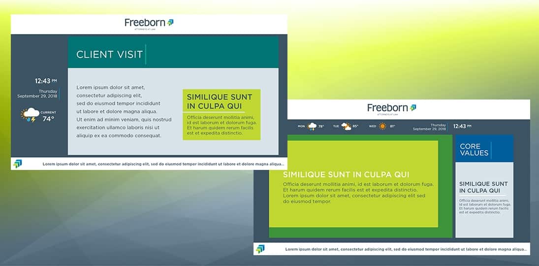
Attract, Don’t Distract
Many designers use multi-zone layouts with several attractors to try and get the audience to slow down and focus attention on the screen. Something like, “oh look, it’s going to rain later, well I’m glad I know that, and what’s that other message say about signing up to a 401K?” A nicely designed weather widget is a great way to get attention, as is a nice big clock with the current time and the date and day of the week.
News tickers are another tool in the digital signage design arsenal – presumably people will slow down a bit to see what’s going on the world and thus increase the amount of time they’re exposed to the screen and its content. However, unless the ticker and the main message in the layout are about the same thing, the ticker can serve as a distraction – the person reads that and then moves on without taking in any other content from the other zones that are pushing out messages.
Because you never know what’s going to pique someone’s interest, many designers use what we might call the shotgun design approach – throw a whole bunch of stuff out there on the screens and hope something grabs a particular person’s attention. As a result, you can often see digital signs displaying three, four or more separate content zones, each with its own message, plus a new ticker scrolling across the bottom, plus an animated weather widget in one corner and an animated clock and calendar in the other, sometimes a video feed or stream as well…and suddenly the digital sign is starting to resemble Times Square. There’s just way too much going on for any of it to be effective.
Simplify
Seriously consider simplifying your digital signage layouts. A single full-screen message that has a beautiful image, nice colors, clean lines, easy-to-read text and clear yet concise content can be incredibly powerful. Done right, such a message can literally stop someone in their tracks, making them take in the content in its entirety, and possibly even delaying them long enough to get another message in front of them (or even two!).
But what about the benefits of attractors? Should we just drop them entirely? No. The key, as Mr. Miyagi advises in “The Karate Kid” is balance; if the balance is bad, pack up and go home (and that’s exactly what your audience will do – they will literally move on).
One of the biggest mistakes organizations make is that they spend a long time researching which digital signage system is best for them, figuring out roles and policies, determining how content will be created and scheduled, and who does those things, and then just sort of stopping there and letting what they have in place run as is forever. Digital signage is a dynamic communications system, which means the only constant is change. Small tweaks here and there, all the time, is what makes a digital signage deployment successful.
Diversify
So, don’t do one thing – do several. Mix it up and keep it fresh. Use a variety of layouts to vary the impact on the eye and keep things interesting. First off, three content zones plus attractors is usually too much. Use such a layout sparingly, and only if the various messages, schedules or other content shown at the same time is extremely clean and simple – each one should only take 1-2 seconds to read and understand.
Better is to vary between layouts with two content blocks and full screen messages. Mix and match attractors as well, so that sometimes weather is displayed, sometimes a ticker, sometimes the clock and date, sometimes just the playlist of messages. Even though almost no one is going to be sitting or standing in front of your screens for minutes at a time (except in waiting areas, of course), you can keep their attention longer with good designs. Keep it always changing, always new, always exciting and fresh. It’s better to have seven simple layout designs rotating throughout the day than one that has seven different content zones.
Simplify what’s on the screen at any given moment but diversify your layouts so each one is uniquely suited to the main message you’re trying to get across. That’s using digital signage for maximum impact. By varying your layouts and reducing the number of content zones, and including some arresting and eye-catching full screen content, you will almost certainly increase the chances that your messages cut through the clutter to attract viewers and inspire your target audience to follow your call to action. Which, after all, is the point.