EPISODE 50 | Host: Derek DeWitt, communications specialist for Visix
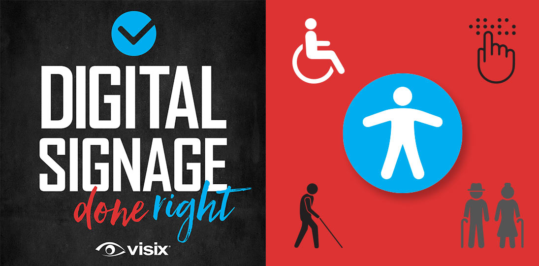
Professional communication is about inclusion. The number and type of disabilities are more prevalent and varied than you might think, and include everything from physical to visual to hearing impairments and more. And with an aging population, it’s more important than ever before to ensure everyone can access and engage with your communications.
The Americans with Disabilities Act lays out steps for how you can ensure your facility, and your visual communications, are accessible to everyone. In this episode, we focus on tips for ADA guidelines for digital signage, specifically:
- Learn about how and where to mount screens
- Explore guidelines for keypads, kiosks and touchscreens
- Consider voice-responsive technology and EZ Access devices
- Discover how contrast, color, fonts and icons can help color blind viewers
- Get lots of links to helpful online resources
Subscribe to this podcast: Podbean | Spotify | Apple Podcasts | YouTube | RSS
Learn more about this topic in our Masterclass Guide 4: Digital Signage Design
Transcript
Derek DeWitt: Somewhere around 20% of Americans have a disability of some sort or another. This is why the Americans with Disabilities Act, or the ADA, is so important. And it is vital for you as an organization to make sure that all of your communications, especially your digital signage, are ADA compliant. We’re going to talk about the ADA and some of the specifics and guidelines that it contains. I’m Derek DeWitt, communications specialist for Visix. And I’d like to thank everybody for listening.
Derek DeWitt: Well, this is our 50th episode of Digital Signage Done Right, and we’re going to talk about something that is important to a lot of people, and that is the Americans with Disabilities Act, or ADA, and how to make sure that your digital signage communications are ADA compliant.
So obviously, as communicators, you want your audience engaged, and in an order to be engaged they have to be able to access your communications. We talk a lot about a consumer-like experience for communications, and everybody is a consumer, even people who have a disability of some sort. So naturally you want to be able to reach out to those people as well. Of course, it’s also now the law. The 1990 Americans with Disabilities Act, or the ADA, has three main sections. Title One covers employers of 15 or more people. Title Two covers government and state facilities. And Title Three is called the “Non-Discrimination on the Basis of Disability in Public Accommodations and Commercial Facilities”, which is basically any building that serves the public.
What is a disability? Well, it could be anything. It could be limb loss, vision or hearing loss or impairment, cognitive disabilities, nervous system disorders. The list is rather long. It’s estimated that somewhere around 20% of Americans have a disability of some sort or another as defined by law. And with a large graying population getting older and older that is certainly going to increase in the next few coming years.
Of course, reaching out to everybody and making sure that everybody can take part in the conversation that you’re trying to start makes sense. It’s the right thing to do. The fact is not everybody is born with a disability. Sometimes it comes upon you due to circumstances, accidents: a soldier gets their legs blown off, an athlete gets hit in the head and loses their hearing, a house painter falls off a ladder and gets brain damage as a result, people get Parkinson’s, Lou Gehrig’s disease, their vision goes…. And this could happen to anyone at any time.
Despite the fact that it’s the law, a lot of companies are still not ADA compliant. Back in 2013, there were about 2,700 lawsuits in the United States for ADA noncompliance. Each year that number goes up. Just five years later, in 2018, the top 10 states for filings numbered over 7,000. These lawsuits are not cheap. It’s pretty easy to prove. Do you have a ramp or don’t you have a ramp? American businesses in 2018, it’s estimated, lost over $200 million as a result of not being ADA compliant. And of course there are more and more consumer activist groups and organizations going after those that don’t comply with ADA regulations and guidelines. And so, we can expect to see this number, and this cost to business, go up.
The ADA has a term that is “readily achievable”. What this basically means is if your facility can be made ADA compliant “without much difficulty or expense” then you must do so. If you don’t, then you’re in violation of the law and you’re going to get in trouble. Obviously, if it’s far more expensive than that, there are grants and other ways to reduce the cost to your organization. The whole idea of the ADA rests on this phraseology of “reasonable accommodation”. What this means is that people who have a disability of some sort need to participate in processes in a way that is equal to people without disabilities. Everybody needs to have access to the same information and what you are required to do is supply the means for that to happen.
So, when we’re thinking about digital signage, one of the first things that will pop to mind is obviously touchscreens and kiosks. You’ve got to start thinking about where do you place the screens, video walls, screen enclosures, can people in wheelchairs (for example) reach them, is there Braille, do you have text-to-speech capabilities, and so on. The easiest thing to do for your digital signage is talk to whichever integrator you used to get the initial system up in the first place. And if you’re thinking about purchasing and implementing a digital signage system, start the ADA conversation before you actually go live so that you’re already compliant on day 1.
Some of the physical considerations for digital signage displays include the following: All screens must have a non-glare finish, and they must have 70% contrast between the background and the actual lettering in the messages that are on the screens. High contrast is easier to see, both from a distance and up close.
If you have a numeric keypad, say on a kiosk, the numbers must be in sequence, which seems logical but I’ve actually seen some keypads that are strange and not one, two, three, four, five. It can be an ascending or descending order, it doesn’t matter, but they have to make some kind of sense. There has to be a raised dot on the 5 key in the center of the keypad, so someone who’s visually impaired can figure out that that’s the middle. Any other function keys have to somehow be visually different. Just think of what your ATMs look like; very often, you’ll have a green one and a yellow one and a red one, all these buttons on the side of the numeric keypad.
Onscreen characters need to be at least 3/16 of an inch high, so no teeny, tiny displays. And again, that 70% contrast from the background is vital.
If your screens are mounted up on a wall somewhere, they can only stick out a maximum four inches from that wall. One way to deal with this is to just recess the screen inside of the wall so that it’s flush with the wall surface itself. However, if you do this, you’re going to have to make sure that you have proper ventilation. You don’t want those screens overheating.
If you have a digital signage enclosure, it can be anywhere from 27 to 80 inches off the floor. Like think about the actual floor material that is under the screen when you’re figuring out what the right height should be. The regulations say you have to measure from the highest point of the flooring material, and the ground space around the digital sign needs to be a minimum of 30 x 48 inches. If you’ve got a video wall, you’ve got to follow all of these guidelines as well.
For touchscreens, the controls can be no more than 48 inches off of the floor, and the reach for them should be no more than 10 inches. Obviously kiosks are great for wheelchair access because you can make sure that they’re the right height automatically. And having a 15 to 20 degree upward slope is ideal for a digital signage kiosk. It might even be worth looking into getting kiosks that have adjustable height capabilities.
But remember, it’s not just wheelchairs that we’re talking about. Voice responsive technology is a great idea for voice-operated screens. Having some sort of a zoom feature, whether it’s a button that’s easy to see and reach to make things bigger, magnifying the image on the screen, or a pinch-and-zoom for multitouch, allows people to see things temporarily bigger, and then go back to normal.
Haptic responses when you’re touching the buttons or the screens are a good idea, just like you have on your mobile phone, your smartphone. Either having built-in speakers or some kind of universal headphone jack with volume control, so each individual person can adjust the volume as they need it to be.
And a lot of the solutions that are out there for people who have hearing disabilities, interestingly enough, also help people who have less obvious issues such as dyslexia, which depending on which study, you look at 5 to 15% of Americans have at least some form of dyslexia. So if it’s hard for people to read, having some kind of voice, text-to-speech capabilities is helpful for them as well.
And of course, you can incorporate what’s known as EZ Access devices. They’re already designed to meet ADA guidelines. What these do is they have electronic interfaces that help people with, you know, reading, cognitive, physical problems, low vision, blindness, and so on, and sometimes they also add in new features and options.
Back in 1998, the Japanese Society for Rehabilitation of Persons with Disabilities published a paper by Chris Law and Gregg Vanderheiden from the Trace Research and Development Center in the College of Engineering at the University of Wisconsin-Madison that goes into quite a bit of detail about touchscreen access and other EZ Access strategies. The ADA checklist for existing facilities, meaning you need to adapt your environment to now be ADA compliant, can be found online at www.adachecklist.org.
But it’s not just the physical considerations that you need to be concerned about. Think about your content as well. As I said twice before, you need to have that minimum 70% contrast. You also need to make sure that you’re easy to read fonts. Which means no using that very attractive, Gothic, crazy font that looks like something written by the Teutonic Knights in the Middle Ages. Sure, it’s nice to look at, but it’s really hard to read even for people who don’t have a visual disability.
So, when coming up with your designs, design it with all the best practices (and again, we have numerous blogs, white papers, and other podcast episodes about that). And then once you’ve done all that, look at it again and think, Okay, what if I had some of the following disabilities, do I need to make any adjustments to the content in order to be able to accommodate those people as well?
When using icons, try and use ones that are rather universal, ones that you’ll see everywhere. Yeah, your design team may have come up with a very funny or very amusing icon on your wayfinding map to indicate restrooms, but it’s actually better to just use the international one that is used everywhere. Icons are actually a great idea anyway, because they don’t take up a whole bunch of space and they’re visual, which means people don’t have to read them.
When it comes to wayfinding, there are a lot of companies out there, when you’re thinking about purchasing or upgrading your screens, that already make ADA-compliant wayfinding signs and touchscreens. By simply adding some kind of interactivity, you’re already automatically becoming ADA compliant. Like if you’ve got wayfinding and a directory on a single touchscreen, boom, that falls very firmly within ADA guidelines and requirements.
Good wayfinding with things like nested directories and maps that draw a line from where you are to where you’re going; these are great things to think about adding. You want to make it as easy as possible. Again, remember not everybody who’s disabled in some way, shape or form is necessarily physically disabled or obviously disabled. Autism for example, is a disability. And you need to make things easier for people with autism as well.
Another disability that might not be so obvious is color blindness. It’s estimated about 8% of men and about 0.5% of women are born colorblind. Which might seem kind of like low numbers, but colorblindness is still very much a real thing.
This idea that color blind people only see gray is not true. What it means is that there’s a reduced ability to distinguish between colors. Only very few people have what’s known as monochromatic vision. The most common types of color blindness are an inability to recognize blue or yellow, or an inability to recognize green and red. Green and red color blindness is the most common.
For color blind viewers contrast is the most important design element. Not just contrast, but using different shades of a color. The idea is you need to be able to create separation for someone who can’t perceive the whole color spectrum. Color blind people just don’t see as much of the visible light spectrum as the rest of us. So for example, if you’re using two shades of red in your design, then one needs to be bright and one needs to be dark, since they’ll just see it as a kind of a gray and they need to be able to differentiate between the two shades. If the shades are too similar color blind, people just won’t be able to see the difference.
There’s a great article on 99designs.com that’s all about color blindness and how you should use it when designing content. Some of the things they mentioned are:
- Try and avoid green and red, green and brown, blue and purple, green and blue, light green and yellow, blue and gray, green and gray, and green and black color combinations. These combinations are especially difficult for people who are color blind.
- Making the whole image monochromatic using different shades, as I said, light versions and dark versions, is a very good way to avoid the problems that arise from color blindness.
- High contrast, as said before, is very important. Just because they can’t see the shades doesn’t mean that they can’t perceive contrast. They can also see differences in saturation and brightness and in hue.
- Bright colors seem to be easier for color blind people to distinguish than dim ones. Dim colors have a tendency to blur all together.
- Sometimes color blind people are able to see color or part of a color if there’s enough “mass” to it. Meaning that if you have a line of color that’s too thin, it just won’t be perceived by their eye and their brain as being that color, but if it’s thicker and heavier then they might be able to pick up on it.
It might be very hard for someone who doesn’t have some sort of color vision deficiency to imagine what it is like to be color blind. There are actually two good color blindness simulators online. One is called the Color BLIndness Simulator, and that’s at www.color-blindness.com/coblis-color-blindness-simulator.
And that allows you to either play around with a sample picture that they’ve already supplied, or upload your own images and play around with it to see what it might look like to color blind people. This will help you make intelligent adjustments. You just have to use JPEGs or GIFs or PNG images that are smaller than 600 kilobytes.
Another one is called Color Oracle, and it works for windows for Mac and for Linux. Some people think this is even better than the previous one. And it shows you very much in real time what is happening when a color blind person looks at the image that you’re supplying. That you can find at colororacle.org. And there’s even a color blind test online colormax.org/color-blind-test. You might think about asking people in your organization if they’re color blind, and getting them to give you direct feedback in your designs before you make them finalized.
And of course, you’re not only saving money in the long run by making sure that you’re ADA compliant because you’re not going to get sued, but you can also tout the fact that you’re completely ADA compliant and even go a little bit beyond the requirements. This is great for PR and marketing. People who have these disabilities will certainly appreciate it, but even people who don’t have disabilities will think, “Well, you know, good on them.”
Social responsibility and community outreach are very important to millennials (and honestly, even my generation, Gen X). And so, customer and employee satisfaction will almost certainly go up if you make sure that everything is compliant. Your brand is suddenly much more modern, much more trustworthy. And as I said before, you’re doing the right thing. And frankly, people expect it.
I am frankly surprised that 30 years after the Americans with Disabilities Act was implemented, there are still lots and lots of organizations and facilities out there that don’t meet the requirements. There’s really no excuse. Probably all you have to do is a few tweaks here and there. And then you’ll be not only following the law, but following your modern audience’s expectations of what a 21st century organization should be doing. You’re also reaching a much wider audience. You’re also getting people more engaged, which is, after all, the entire point of your digital signage deployment.
So follow the law, do the right thing and make sure that you’re following all of these guidelines. The last update was in 2010 and we’re due for another one pretty soon. So, check out that website and keep current on what the new rules and regulations are.
I’m Derek DeWitt, communication specialist for Visix, and I’d like to thank all of you for listening.