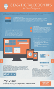
In design – form always follows function. The goal is to impart information, so it’s important to have a basic understanding of some basic design rules to make sure your digital media is readable as well as attractive. We’ve put together some easy digital design tips that anyone can follow:
- Contrast and legibility
- 3 x 5 Rule
- Text styles
- Color and perception
- Focus techniques
- Previewing
The most important thing to remember is that digital design is very different from print design. Not only is the area and shape of where you’re presenting your design different, but color and contrast shifts, fonts look a bit different and there’s a wide array of how technologies will handle different files and formats.
Although basic design principles still apply, digital affords you a lot of options that print doesn’t. You can add interactivity, attract attention with animation and incorporate audio and video techniques for higher audience engagement. Just stay true to the goal – relating information to inform, educate or motivate your audience.
Need some help designing content for your digital signs? We can help. In the meantime, grab our infographic for a 6 easy digital design tips for a basic primer on designing for screens:

Need more advice on designing content for digital signs? Read our white paper here.
