The way people perceive and respond to digital communications is quite different than how they react to printed communications. It’s important to optimize your designs, so people can get the information they need quickly, get engaged with the content, and then take your call to action.
First, Understand the Communications Process
Think of communication as a dynamic exchange, not just sending out information. You want your audience to not only see your messages but also act on them. It’s about engaging and compelling content that catches their attention and drives action. Your messaging should be informative, visually appealing, and relevant to make an impact.
It’s crucial to keep in mind that with digital signage, there is no face-to-face interaction or opportunity for clarification. Messages must be clear and impactful to grab attention and drive action. Understanding your audience, message format and follow-up strategy are key components in creating effective communication. By following these principles, you can engage your audience and motivate them to take desired actions:
- Distill what you want to say to its simplest form. Only include elements that help people understand the message. Tone and visual elements will help influence how your communications are received.
- Determine exactly what you want the viewer to take away from the communication. Emotional and motivational triggers can help guide people in the direction you want. Keep it short, keep it simple and keep it clean (meaning, no errors of any kind).
- Determine the best means to deliver the information. Is your digital signage really the best way to get this one item across? If not, maybe choose another delivery method. Think about where and when the audience will see the message.
- Craft and deliver your message accordingly. Part of this is knowing your audience, which not only includes an understanding of what’s interesting or important to them, but also an awareness of their cultural and personal contexts. The environment they’ll encounter the message is also something to keep in mind.
- Make sure your audience understood your communication by supplying an easy-to-follow call to action (CTA). If they follow the CTA, then there’s a good chance they not only understood your message but were engaged with it. If they don’t, try to get some feedback as to why not. Was the information not relevant, or was there something in the wording or design that turned people off?
This sort of thinking will guide your actual design, helping you choose the right elements to grab people’s attention and achieve your communication goals.
Curation vs. Creation
Before diving into design advice, consider exploring existing resources that may align with your goals. Content curation not only saves time but also provides a reservoir of inspiration to tap into when needed. Content curation involves discovering and compiling relevant content in advance such as articles, videos, graphics, blogs and quotes. By organizing these resources by topic, you create a valuable reference for future use. Utilize browser bookmarks or online curation tools to streamline the process. When transforming curated content into digital signage material, add your unique perspective to make it meaningful for your audience.
6 Digital Signage Design Tips
Designing content for digital signage is an exciting and creative process that lets you play with colors, contrast, text and layout. Remember, the ultimate goal is to inform your audience. In design, function always comes before form. It’s crucial to grasp some basic design principles to ensure your content isn’t just visually appealing but also easy to read.
Here are our top 6 digital signage design tips:
1. Contrast and legibility
Your message can get lost if the viewer can’t easily separate the elements of your design. Poor contrast reduces legibility, good contrast improves it. Always make sure there’s plenty of contrast between your background and foreground colors, especially for text.
2. The 3 x 5 rule
Don’t clutter your designs with too much text. Keep the type size large for readability at a distance, and present only the most important information. Try not to use more than three lines of text of five words each OR five lines of text of three words each. This distills your message down to its most important elements.
3. Text styles
Fonts
Unless you’re duplicating a brand or logotype, keep the font simple and legible. Never use more than two fonts in a single design and use italics sparingly, as they can be hard to read from a distance. Also, large text and bold lettering can help improve readability.
Use a sans serif font. These are easier to read from a distance in short messages. Serif fonts are better for printed texts like books, since the small strokes on each character help guide the eye. But in a digital medium, serifs just create visual clutter.
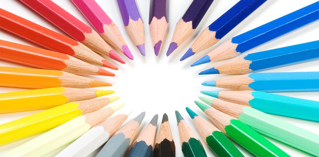
Color and Perception
Color creates good contrast, and color choices should place your foreground elements, like text, perceptually in front of your background design
In the digital world, three basic colors are used for color mixing: red, green, and blue (known as RGB). All other colors are created from these three. White is combination of all three RGB colors and black is the absence of color. The human eye is most sensitive to green, with red coming in second, and our eyes are least sensitive to blue. To improve your designs:
- Use contrasting colors – light on dark or dark on light
- Understand what your viewer’s eye is drawn to
- Control the impact of information
4. Focus Techniques
Guide the eye to critical information first and create a visual hierarchy in your design. Headlines, graphics, bright colors and high contrast items will pull the eye to them. Size also tells the audience the priority of design elements, as does their arrangement, angles and use of open space.
5. Previewing
When previewing your designs, consider where your eye goes first and adjust your design to ensure that the most important elements take priority. Test readability and visibility on your own monitor before publishing out to digital signs. A good tip is to stand back from your monitor at least five feet because this simulates your audience’s perspective for viewing screens at a distance.
30 Trends in Digital Signage Design
- Form always follows function, and this is especially true in interactive design.
- Remember: your digital signage message will be displayed for an average of seven seconds. Everything needs to be conveyed in that short window of time.
- Mobile integration has become essential. In fact, it’s now commonly thought that you should design things from a mobile-first perspective.
- Interactivity is becoming more important – vast amounts of information organized in such a way that the user determines how they access it. People are so used to interacting with information through mobile devices that digital signage needs to emulate a “consumer-like experience” to be accepted and useful.
- Internet-enabled interactive screens let people save a step by opening a web browser right there, taking them directly to a webpage.
- QR codes have started being used everywhere. They’re easy to integrate into a design and give the audience an opportunity to get more information that won’t fit in your digital signage message.
- Innovative scrolling adds a “wow factor” to an audience that already takes interactivity for granted. This mimics tickers that people are used to reading on news sites.
- Voice controls (VUIs, or Voice-User Interfaces) are starting to improve to the point that this will likely be the interactive interface of the future.
- Present simple icons and icon systems instead of lots of text. Show instead of tell, whenever possible.
- Geometric shapes, especially circles and rounded shapes are always popular.
- Use negative space in innovative ways to lead the eye.
- Use bright and bold colors – not too many, maybe only two or three – but be “courageous” with your color. A shade not seen very often will certainly grab attention.
- Every year, design trends shift. Stay on top of changes by checking the web early in the calendar year. For example, every year, Pantone unveils their Color of the Year. Like it or not, this color will start showing up all over the place, and people will soon start associating that color with ideas like “modern” and “up to date”. Adobe also releases a Graphic Design Trends blog each year.
- There’s always some decade or era that is currently experiencing a revival, or at least a bit of nostalgia. Explore an updated version.
- Show organic images – things like trees, plants and flowers, as well as natural textures, like wood grain or stone.
- Modern culture celebrates differences. Design content with your brand in mind, especially what sets its culture apart from others. Celebrate uniqueness.
- Include images of strong women, multi-ethnic groups and images that suggest wellbeing.
- Hero images are becoming the standard for websites and other digital portals – this is a large image with just a bit of text on it. Consider using these once in a while for messages as well.
- Use photos that seem authentic – candid shots of people rather than posed. People also like seeing their own pictures displayed, so incorporating social media will find a receptive audience.
- Video is still very popular, provided it’s attractive, tells a story and is short (no more than 60 seconds, and preferably half that).
- Using storytelling elements to create content campaigns over time is still extremely popular and very successful at grabbing and maintaining interest.
- Designs for messages being shown in landscape orientation will necessarily be different than those shown in portrait orientation.
- Make sure you’re designing for the endpoint displays’ resolutions. This includes visual elements like pictures and logos. Exploded or pixelated elements detract from the audience experience.
- Higher resolution displays, like 8K Ultra HD, are becoming more commonplace. More unusual shapes (instead of just rectangles) are also becoming more widespread, as are unusual configurations of displays to create a larger display area.
- There are many types and sizes of displays today, and they can be placed just about anywhere. Many organizations are finding surprising spots by analyzing traffic flow patterns through their facilities.
- Simplicity is the new watchword for digital signage – it needs to be agile and able to be updated from anywhere, by anyone with access. The same goes for creating or importing content.
- Personalization is another watchword – you want to be able to cater to various types of customers, all of whom have their own preferences.
- Proximity marketing is on the rise, with screens interacting with people’s portable devices through Bluetooth or other technology like wayfinding beacons to send info directly to a handheld device.
- Tailored content in playlists will become a major factor in digital signage in the future. The days of creating a single playlist and letting it run forever are gone. Playlists need to be flexible and responsive to the audience. Analyzing traffic flows and preferences will allow an organization to display playlists tailored to certain audiences at certain times of the day in order to maximize the impact of the messages.
- Performance analytics are also on the rise – constantly improve communications by measuring what people do (and don’t do) at your screens. As digital signage becomes more commonplace, flexibility and data-driven ROI are essential to keeping ahead of the pack.
Use Icon Systems
Digital signage icons are another way to help your audience recognize their favorite information quickly and easily. They communicate ideas, meaning and function in a common visual language. People are well-tuned to icons because they’re so common in everyday life – from exit and restroom signs to applications on our smartphones.
Using icons in your layouts or content can improve the audience experience by directing them to what they want to see faster. Consider using icons for common posts or feeds like news, weather, events, RSS and social media. After a little time, people will see the icon and instantly know what they’re reading.
Another tip is to standardize your screen layout so that digital signage icons and their related content are always in the same place (e.g., weather, news and events are always on the right side). The goal is to lead the reader to the information quickly. Consistency is important so viewers don’t have to check different parts of the screen for the information they want each time they check the screen.
If you’re developing touchscreen content, icons will play an important part. Basic icon systems and legends are part of every interactive wayfinding map, directory and POS kiosk because they convey a complex idea in a small space (a silhouette of a head and shoulders means “touch here to browse a list of people”).
It’s fine to want to be creative – but you don’t need to come up with new, fun icons just for the heck of it. Common ideas already have established, recognized icons, and you should use those as often as possible.
There are lots of free or cheap icon sets already available through online vendors, so you don’t need to create your own. With a quick Google search, you can find nearly any icon you need. You can also use resource banks such as Shutterstock or websites like Pixabay.
The Case for Flat Design
Flat, semi-flat design and minimalist designs have been around for a while because they’re very effective in digital formats. These use clean spacing, bright colors, crisp edges and two-dimensional illustrations for simpler, cleaner elements that make shapes and information easier to read on a variety of screen sizes. If you look at your Windows start screen or your smartphone, most of the icons are using flat or semi-flat design.
This minimalist approach is great for digital signage content because it not only modernizes your designs, but it also makes imagery easier to read on busy screens. Flat design also lends itself to icon systems, which are a great way to standardize content types for easy recognition by your audience.
Wayfinding maps and interactive content can especially benefit from flat design. Instead of buttons looking like pop-up bubbles and maps being cluttered with shading and shadows, a flat type of design presents a lot of information clearly and cleanly to help the user navigate faster.
Flat doesn’t have to be boring, either. The use of bright colors, good contrast and intuitive shapes can grab attention and help guide the viewer’s eye.
As we always have to remind ourselves – form follows function. The goal is to communicate your message and lead your viewer to the information, button, map or other data you want them to see, interact with and use. The simpler and more striking the design elements, the easier that is to achieve.
Some Useful Tools
Here are a few links to online resources that can be invaluable to any digital content creator:
Free Graphic Design Courses
Browse this list from Format of 15 online design courses you can take to gain knowledge, or refresh what you already know and get inspired: https://www.format.com/magazine/resources/design/free-online-graphic-design-courses
If 15 isn’t enough, or you don’t have time for a whole course, you can always try this list of 60 lessons on all aspects of design theory, from typography and UI to color theory, design theory and more: https://design.tutsplus.com/articles/50-totally-free-lessons-in-graphic-design-theory–psd-2916
Digital Color Meter
Try this simple freeware tool for PCs that helps you determine the color value of any color on your screen. It also has color mixers, so you can experiment and explore options: https://getsharex.com/
Mac users can use the built-in Digital Color Meter that gives you any color you drag the eye dropper pointer over in three values – RGB, hexadecimal and percentage: https://support.apple.com/guide/digital-color-meter/welcome/mac
List of Common Display Resolutions
Who knew there were so many different resolution options? Well, Wikipedia knew: https://en.wikipedia.org/wiki/List_of_common_display_resolutions
Aspect Ratio Calculator
Here’s a favorite tool of end users and AV integrators to help you make sure you’re always at the right resolution: https://www.digitalrebellion.com/webapps/aspectcalc