EPISODE 63 | Host: Derek DeWitt, communications specialist for Visix
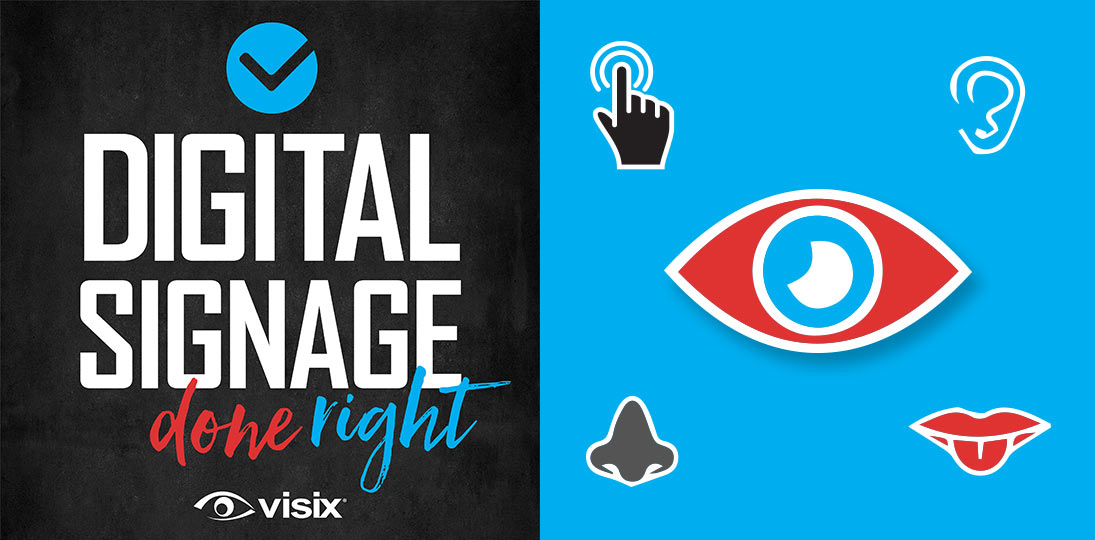
Immersive experiences are being pioneered in a number of fields using experiential design concepts. Though digital signage is mainly a visual medium, there are ways to engage the other four senses as well. Yes – hearing, touch, smell and even taste.
The more ways you can get someone’s attention, the better chance you have of attracting them and giving them an experience that they’ll remember for a long time. And that means they’ll remember your message and your brand longer. This is more than thinking outside the box, it’s thinking outside the eye.
- Learn how much each sense influences how we process information
- Understand the importance of high-quality visuals and motion
- Explore ways to use audio and music effectively
- Consider using scent diffusers to add a smell element
- Don’t forget about haptics to engage the tactile sense
- Surprise people by offering a way to engage their taste buds
- Hear examples of how experiential design elements can work independently or together
Subscribe to this podcast: Podbean | Spotify | Apple Podcasts | YouTube | RSS
Get more content ideas in our Masterclass Guide 3: Digital Signage Content
Transcript
Derek DeWitt: Digital signage is a dynamic messaging system. And when most people think of it, they think of it as primarily a visual means of communicating. But there are four other senses that we can also use. Welcome to the weird and wonderful world of experiential communications, in which we try and incorporate all of the senses into a new, more comprehensive way of getting our message across.
So, obviously the five main physical senses are sight, hearing, touch, taste and smell. Digital signage is, as I said, primarily a visual communication. And that makes sense, since 80% of the information human beings process from the world around them comes to them through their eyes. If something is beautiful, or nice to look at, obviously it attracts us. And that’s the first way to get people to start paying attention to what you’re trying to tell them.
Human beings evolved in an environment in which motion could mean either a food source or danger. And so, motion automatically triggers attention responses in us. This is one of the reasons why video, or even just a still image that slightly drifts (in what’s often known as the Ken Burns effect) is highly effective in a communications medium such as digital signage. Little attractors like weather, and date and time, and even tickers and newsfeeds are also things in motion, and so grab attention.
Obviously, a lot of people are going 4K and now there’re even 8K displays available (another way to grab people’s attention and make them say, Ooh, I need to stop and pay attention to this). Video walls are certainly deployed for that “wow factor”. And a thing that I continually try and push, though I don’t see being used very much, are cinemagraphs, which are still images with a single element that is moving. So, for example, a picture of a person sitting at a desk with a cup of coffee in front of them, everything is static except for the steam coming off of the coffee that is moving. Or a waterfall, a picture of a waterfall, but only the water in the waterfall is moving, everything else is static.
Of course, you also want things to be clean. You want the eye to feel like it can rest on certain visual elements, throwing too many things at once up on a screen is cluttering and annoying, and actually just become a sort of a visual white noise, making the person tune out what you’re trying to tell them.
I think a very good way to use images is to take a page out of a presentation format that comes out of Tokyo called Pecha Kucha (sometimes mispronounced as Pecha Kucha). This is Japanese for the sound of people babbling together in a room, that hubbub of a crowd. It was started by two expats in the architecture business who were tired of seeing really, really poor PowerPoint presentations. You know, the ones where people put a whole bunch of text up there, and then turn around and read it to you.
And so, they developed this 20 x 20 rule: 20 PowerPoint slides, on each slide is an image. They are set to display for 20 seconds, and after 20 seconds, the slide automatically changes. The presenter must give all of the information for that slide in that 20 seconds. It’s best if it’s just an image up there and the only words are spoken by the presenter.
This is a very nice way to take a complicated message, you chop it into 20 parts, you make those 20 seconds each. You come up with an image that epitomizes or reinforces what you’re saying, and then you kind of do an elevator pitch for that bullet point, that concept. Then what you get is a dense but concise presentation of under four minutes, leaving tons of time for clarification and exploration in an extended Q& A session.
I think this kind of a format is a very good thing to keep in mind when designing digital signage messages. Though digital signage messages shouldn’t be up for 20 seconds; they should only be out for somewhere between seven and ten seconds. So, you have to be even more concise. And you need to have a call to action to route people to more information.
Because the brain processes visuals differently than it processes text (when the brain processes text it has a tendency to do it in the auditory part of the brain) QR codes are a fantastic way to get across a call to action in a visually compelling way. It’s there on the screen, the brain is still processing it as visual information, but we all know what it is by now. And it will take us immediately to a dedicated webpage or intranet page, or what have you, where I can dive in as deeply as I care to.
About 10% of the information we humans gather from the world around us comes in through the ears. Does that mean that you should use audio with your digital signs? Hmmm, maybe, maybe not. The number one caveat is it really depends on where the display is located. If it’s in, say, a hospital lobby, do you really want to have the same sound clips again and again and again, repeating over and over every, let’s say every five minutes or so, subjecting people who are waiting there for half an hour, an hour, maybe two hours to that sound clip repeatedly? It could go from, Wow, isn’t that interesting to Man, that is really annoying, pretty quickly. And I’m not even talking about the poor people at the nurses’ station or the receptionist who has to listen to it all day long.
You also wouldn’t want to use audio in a big echo-y lobby with lots and lots of people. It would just add to an already chaotic auditory space and again, either get lost or be an unwelcome intrusion into people’s thoughts as they go from one spot to another.
Now, if you’re streaming a newscast on your digital signs, you probably should have the sound on. And so that’s something to think about. It’s kind of weird to have just a talking head saying things and we can’t hear what they’re saying. A way to work around this is to, if it’s possible, somehow have subtitles on so that we can at least read what the people are saying. This could be a closed-captioning option in many systems and displays. I also think if you’re going to do this, you should probably show it fullscreen, not a tiny little thing in one content zone in the layout. Show it fullscreen and then go back to your other layouts.
Music is obviously a very important auditory thing, helps draw attention as well as define a brand. Think of the NBC bong, bong, bong (or however it goes), those three tones that everybody knows means NBC.
Despite the fact that muzak and background music gets kind of poo-pooed and made fun of, having calming ambient music in the background actually has a number of positive benefits. A study a few years ago showed that in financial institutions (we’re talking like banks and credit unions), if there was background music playing, people felt that the time passed more quickly. Over three-quarters of the people who participated in the study said that they perceived that their wait time was shorter, even though it wasn’t. And strangely, a little over half of the people surveyed said that while there was ambient music playing in the background, they felt more comfortable talking with a representative of the financial institution about confidential information. As if somehow the music gave them cover.
But even just having a short moment of audio can add a bit of a punch. Try and imagine if you’re trying to get people to go to the onsite café, just a quick two second clip of the sound of percolating coffee, to grab people’s attention, and then that’s reinforced by a visual (or a cinemagraph, ahem, ahem) of a cup of coffee, really nice high quality. That sound combined with that visual will trigger a lot of coffee drinkers to thinking, Hmm, I think I need a cup of coffee!
Or let’s say you’re doing a charity drive for a local animal shelter and you have the sound of a puppy or a kitty cat going “meow” certainly will make people look around real quick. Again, use this sort of thing sparingly. Having a little “meow” show up every four minutes is going to drive some people who are in the space for a long time insane.
Obviously, holidays lend themselves very often to some kind of a sound. When you think Christmas, you think sleigh bells. When you think Halloween, you’ve got all sorts of things (ghosts, zombies, creaking doors, lightning). New Year’s Eve is a party, fireworks is for the 4th of July, and so on. It’s going to be a nice way to add just a little extra oomph to your messaging.
And we’re talking about using this only once in a while. If every single message has a sound, it just becomes annoying. The sound won’t stand out, and it will just get lost and get ignored as part of the background. But every once in a while, there’s that cat or there’s that zombie saying “braaaains” or what have you and people go, Oh, oh it has that message, oh yeah.
One thing we often fail to keep in mind is that not everyone is a native English speaker. So if you’ve got an awful lot of people in your area who speak Spanish, let’s say, and you’ve got this fantastic Spanish language capability on your interactive touchscreen and wayfinding, and you want people to know that, maybe a little clip of it every once in a while saying “Hola” or “come over here for directions” in Spanish, or something like that, would certainly grab the attention of any Spanish speaker who happened to be nearby that display.
There are numerous studies on what sounds people like and what sounds people don’t like. Generally speaking, lower range sounds are more pleasant to us, somewhere between the 300 and 3000 Hertz range, which interestingly is also basically the range of the human voice. Sounds that are much higher, somewhere between the 2000 and 5000 Hertz range, tend to get a little bit irritating.
The four most pleasing sounds are the sound of applause, thunder, water flowing and a baby laughing. Other sounds that people find pleasant are the sound of rain, a fire crackling, certain sports sounds like the crack of a baseball bat hitting a ball, the sound of walking on snow and the sound of food cooking, especially meat on a grill.
So that’s the top two, sight and sound. What about smell? It conveys about 3 and 4% of the information that we take in. I think it’s pretty common knowledge by now that smell is deeply associated with memory. There was even a book many years ago called A Natural History of the Senses that postulated that smell was maybe the very first highly developed sense in what would eventually become Homo Sapiens Sapiens, and that all of our other senses grew to augment the sense of smell.
There have been experiments in the past with scent marketing, especially in public spaces with food. Again, you really should use it sparingly. Now there are small devices that you can attach to displays or kiosks that will emit certain smells. Usually it’s a combination of chemicals that trick the nose and brain into thinking that they’re the item, like popcorn or something. These are called scent diffusers.
There was a rather famous case in the subway system in Shanghai a few years ago. Underneath a rather large shopping center, a complex system of flat screen cubes that had images on all sides (so you could walk around them), and sometimes an image of the ocean would come up and then scent diffusers hidden inside the cubes would send out this kind of tangy saltwater scent, and tiny speakers would also beam out the sound of waves gently crashing on a beach. This was just one of several multi-sensory displays that they used. Another one included a field of flowers and there was even one with a forest. People who interacted with it said that the multi-sensory display left an impression that lasted for weeks and weeks after they encountered it.
I think that idea of using a sense of smell along with an image and/or a sound makes sense. It would be weird to suddenly just have the smell of the sea come out of nowhere for no reason. Like with sound, there have been several scientific studies on what smells humans like. Among the top are freshly cut grass, freshly baked bread, the sea (obviously), the smell of fresh laundry, flowers, Christmas trees, vanilla, wood fires, lemon, chocolate and vanilla, and the smell of old books.
Fourth on the list is the tactile or the sense of touch. So, this is somewhere between 1 and 2% of the information that we get from the world around us, by the emotional impact far outweighs that statistic.
Early smartphones were completely smooth and there was no sense of interaction with them. It was a purely visual experience. So they actually had to go back and put in haptic responses. That’s when you’re interacting with your buttons or whatever on your phone screen, and it’s just a tiny little vibration to make you feel like you’ve actually touched something. Obviously, an interactive touch screen is tactile and putting in haptic responses is maybe not a terrible idea there either.
Interestingly, there are some studies that show that if the experience is pleasant, people will spend more time in front of an interactive screen than they will in front of a static one, or one that they can’t interact with that just changes messages every seven seconds or so. They feel like they’re achieving something or doing something. And that means that they’re interacting with your brand and your messaging for a longer period of time.
But think about other things as well. So, you’ve got your interactive kiosk or touchscreen – what’s it in? Does it have hard, sharp-edged corners around it? Maybe go for something that’s more rounded or more pleasing to touch. What about putting a nice soft pad or something on the floor in front of it? Not only is it a visual cue for, hey, stand here to interact with this screen or kiosk, but it’s more pleasant on the feet, encouraging people to spend more time there.
Obviously, you have to consider ADA regulations and make sure that things are wheelchair accessible and so on. And that if you do have padding, it doesn’t interfere with the operation of a wheelchair or trip someone who’s visually impaired. So, you know, it has to be done with a little bit of care. But when it comes to digital signage and the sense of touch, I think haptics is definitely your best bet.
And last, but certainly not least is the gustatory or the sense of taste. While overall, as we maneuver through the world, it accounts for less than 1% of all the information that we gather in a given day, it’s a very, very powerful sense. It’s very tightly linked to smell. In fact, 80% of what you taste is smell. Ask anybody who’s gotten a really bad case of COVID. When their smell is knocked out, suddenly things just don’t have the same taste that they used to.
The sense of taste actually evolved to help us know when maybe we shouldn’t eat something because it was bad for us or poisonous. Today, that’s probably not really much of a concern and we mainly use it for pleasure. So what am I suggesting? Lickable interactive touchscreens? Of course not. But if you’re advertising something like coffee or something edible or something to drink, consider having a table of some sort out with samples of the items in question. And then when they show up on the screen, people will say, Oh, here’s this coffee here, I’ll try it.
Now, obviously that’s not going to work in a hallway, but you could have a call to action that immediately instructs someone to go to, let’s say the onsite café, and give a code word that they can only get by seeing it on the digital sign and they get a free sample.
The thing to think about here is try and imagine trying to use all of these things together. So you have a high-resolution, high quality, beautiful image; maybe some kind of a small, short sound that’s pleasant associated with that image. If you’ve got an interactive screen, there are haptics there, so when I touch it, I can feel like I’m really interacting with something more than just the flat surface of a glass screen. Maybe there’s some kind of a smell being dispensed. And lastly, there’s a sample for me to taste or a code word for me to use for someplace nearby where I can taste the thing that I’ve just been looking at. All of this comes together to create a full multi-sensory experience that I am sure to remember.
There are already things today in existence that seemed like science fiction 20 years ago. And in the next 10 years, we’re sure to see a lot more. And more and more organizations are doing everything that they can to differentiate themselves from the competition and stand out from the crowd. And the crowd is increasingly getting larger and larger and larger. Not to mention augmented reality (AR) and virtual reality (VR), which are up and coming (and we’ll probably talk about those in a whole separate episode of this podcast).
The main thing to keep in mind is if you’re going to use any of this stuff, it has to be good quality. Low-res images actually have a negative impact; better to have not used an image at all. An irritating sound or a really poor-quality recording is just going to set people’s teeth on edge. And a smell or a taste that’s unpleasant is going to have the exact opposite effect than what you were trying to do. Instead of making them think, ooh, wow, I’m super engaged right now, you’re going to make them think, my god, I need to get away from here as quickly as possible.
That negativity will automatically associate, not only to the specific thing you were trying to communicate, but probably to your entire digital signage system. Oh my god, they say in the break room. Did you smell that thing coming out of that sign? What the heck was that?
In a world of constant distraction and information overload, where people are very often moving through your physical spaces on their phones, using non-visual sensory triggers and attractors is a great way to grab their attention.
If I’m already looking at my phone and you have a nice image up there, I’m not going to see it. But if I hear a sound or smell something or something like that, I might think, what the heck was that, and look up from my phone. And now you’ve got my attention for a few seconds at least.
Again, you may think, oh my god, this is ridiculous, why would I even want to do all these things? As more and more organizations and businesses are opening up, a lot of employees have gotten quite used to working from home at least part of the time. And so, utilizing some of these multi-sensory techniques, you help truly differentiate the in-office experience from their at-home remote workplace.
You might even entice a few people to come into the office more often because somehow there’s just something about it, something indefinable that I find very pleasant. And they might not even remember that it was the sound of the waves crashing on the beach and the smell of the sea that gave them that impression.