EPISODE 100 | Guest: Debbie DeWitt, marketing communications manager for Visix
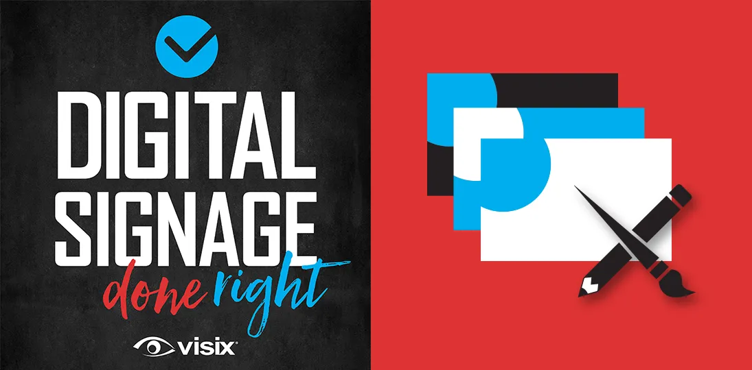
Design themes are super useful for both launching and maintaining momentum on a digital signage system. It helps you maintain consistency, helps reinforce your branding and it makes things a lot easier for multiple content contributors. Most importantly, it makes your screens look good.
In this episode, we’ll walk through the different element of a digital signage design theme, talk about why you need one, and give you lots of inspiration and links to get started.
- Understand what a design theme includes
- Learn the benefits of using themes for digital signage
- Get ideas for different types of design themes
- Discover where to find theme inspiration
- Hear about different ways to create a theme
Subscribe to this podcast: Podbean | Spotify | Apple Podcasts | YouTube | RSS
Get more screen design advice in our Masterclass Guide 4: Digital Signage Design
Transcript
Derek DeWitt: With the end of the year holiday season kicking off soon, lots of people will be looking for ways to refresh their digital signage or maybe just add some holiday fun into digital designs. Design themes can help with both of those. And to talk about that today, I’m joined by Debbie DeWitt, marketing communications manager for Visix. Hi, Deb.
Debbie DeWitt: Hi, Derek. And happy 100th episode of DSDR.
Derek DeWitt: I know! Thank you everybody out there for listening to this episode of DSDR, Digital Signage Done Right. Hundredth episode. Woo hoo!
Debbie DeWitt: Woo hoo!
Derek DeWitt: Fireworks, fireworks. Don’t forget, you can subscribe to this podcast, and you can follow along reading the full transcript, which is on the Visix website under Resources/Podcasts.
Okay, Deb, So what is a design theme?
Debbie DeWitt: A theme’s just a set of visually coordinated elements. You want to design so that everything matches and is consistent across mediums. When we’re talking about digital signage, that can include your layout backgrounds, message backgrounds, templates, artwork, all the stuff you’re using in your designs.
Derek DeWitt: So like, basically you make sure, like colors, your images, your fonts, everything works together, right?
Debbie DeWitt: Yeah, exactly.
Derek DeWitt: All right. So why would you want to use a design theme on digital signs? Why can’t I just remember what I did?
Debbie DeWitt: Well, a lot of people don’t remember what they did, or maybe they weren’t the one designing it. And the reason you want a theme, the reason you want all of your elements to be consistent is, as we’ve said, I don’t know, let’s go with a hundred times…
Derek DeWitt: A hundred times !
Debbie DeWitt: …if your screens look bad, people are going to tune out. So, if you’re using templates, applying a theme can ensure that everything goes together visually. But it’s also important because that way, no matter who’s filling something out, anybody who’s posting a message, it’s all going to look good together.
Derek DeWitt: Right. And it kind of streamlines the process if you have multiple content contributors, I think as well. It’s a little bit, I don’t want to say you’re idiot proofing it, but you are making things more standardized and therefore faster.
Debbie DeWitt: Yeah, exactly. You’re saving everybody time and headaches. Especially if, like, you’re trying to control your branding. You want to make sure your look is consistent with all your other marketing communications efforts. You know, you don’t just want something out of left field using some PowerPoint template or something that no one’s ever seen before and doesn’t match.
It’s also a great way to differentiate your screens for, like, different areas or locations or seasons. You know, you can have your Miami office use one set of designs, you can have your New York office use another. Maybe it’s down to the department, like HR.
But you know, all of those still need to have that top level company or organizational branding.
Derek DeWitt: Don’t you run the risk then of wow, everything’s always the same and, and therefore people start tuning it out?
Debbie DeWitt: Well, not if you’re doing it right. I mean, that’s why we’re talking about a refresh, you know? And especially with holidays, that’s a way to make your screens look different, and it grabs attention because as you said, if the same thing’s up there all the time, people are going to tune out. So this can give you some more variety. I mean, you might design one theme at a time, but you’re going to want to change those up periodically.
Derek DeWitt: Hmm. Okay. So what kind of themes can we make?
Debbie DeWitt: Well, there’s really no limit. I mean, it’s graphic design, so your imagination is your limit. As always, it’s really about what makes sense to your audience and to your brand. We’re always reinforcing, you need to know your audience, so do something that appeals to them.
Some common design themes for digital signs that we’ve seen are based around branding. Obviously using your identity colors, your logos and graphic elements. And most brands actually have two colors at least. So, you know, if your colors are blue and green, have a theme in blue, a theme in green, so that you can change it up periodically.
Derek DeWitt: Sure, that makes sense. And you mentioned seasons earlier. I think that’s quite interesting. Obviously, we think of, you know, fall and spring being the more colorful ones, but that’s an interesting thing to do.
Debbie DeWitt: Yeah, we see people do it for seasons, or even for semesters. If it’s a college campus or a K-12 school district, they might change it up for different periods of the year.
You can also, like we talked about, holidays are great. You know, you want to do Halloween or Independence Day, have a whole week with a different look. You can also do monthly themes for things like Black History Month, Women’s History Month. Again, there’s a lot of inspiration in holidays and seasons, things like that.
Derek DeWitt: Yeah. Like I think around the, you know, the end of the year, winter solstice stuff, you know, there’s Christmas, but there’s a whole bunch of other stuff in there, too.
Debbie DeWitt: Yeah. And a lot of that might come down to individual content pieces, but your overall design theme could certainly be something like a winter background or a more festive background that then the messages celebrate all those different holidays.
Derek DeWitt: And you said locations. What about like, even inside of a, a particular campus or even a particular building, could you have different areas like departments of things, color coded sort of or thematically coded?
Debbie DeWitt: Yeah, I think so. Absolutely. You could do it by locations or buildings or floors, or even down to the department. I mean, that is a lot more work, so I will say you’re, you don’t want to have like 20 themes going on, and they do all have to tie together and again, be under that corporate umbrella.
But definitely like one theme for public-facing signs and another for in-staff areas. That’s a really nice differentiator, especially in something like retail where people are popping back and forth a lot. So, that way they could instantly, you know, their brain switches from, oh, that’s the public advertising, to now this is a staff announcement from HR.
Derek DeWitt: Right.
Debbie DeWitt: Also, manufacturing plants might have one theme for the production floor and another for the offices. Again, it’s whatever makes sense to differentiate the screens for the audience.
Derek DeWitt: Ah, I guess that makes a certain amount of sense. And keep in mind, if you share the same playlists across different locations, you’re going to make sure that the backgrounds match that theme, right? That’s where maybe like having two branded sets can come in handy,
Debbie DeWitt: Right. Again, you could do blue on green, one place, green on blue, the other, or…
Derek DeWitt: Right.
Debbie DeWitt: …even better, you know, use PNGs with a transparent background. Then you don’t have to worry about it.
Derek DeWitt: Right, right. What about animations or video? Is that part of a design theme?
Debbie DeWitt: Yeah, that could be a great way. Again, we were talking about that sort of winter background. If it’s like a really gentle snowfall or something, or maybe in autumn, you’ve got leaves. But a little animation in the background is always a good way to draw the eye.
One idea is to have, like, one photo with four different color tints, you know, for the different seasons. Or if you are using animation or a video, the same thing, you can tint it differently. You could have a lens flare or something that is consistent, but have some visual element that ties everything together.
Derek DeWitt: Right. When we say video animation, we’re not necessarily talking about, you know, a video like you see on YouTube. It could just be like you said, a lens flare. Like, hey, in this theme it’s a blue lens flare, in this theme, it’s a gold lens flare, so on and so forth.
Debbie DeWitt: Yeah, and the important thing is you always want to keep those animations, if they’re on a layout background, you want to keep them really subtle, so they don’t interfere with whatever’s on top of them; your other messages, event schedules and that kind of thing.
Derek DeWitt: Right! The purpose of the message is not, hey, lens flare. The lens flare is to make people, oh, what’s that? Oh, interesting information. Right.
Debbie DeWitt: Right. Somebody in a waiting room, I’m blind!
Derek DeWitt: Right. Yeah, exactly. So where can you get design theme ideas from? Where are some places for inspiration?
Debbie DeWitt: Well, visual inspiration’s kind of everywhere. You know, you have the entire world to inspire you. We’ll go ahead, I know that’s a lot, so…
Derek DeWitt: Just go walk around.
Debbie DeWitt: Oh, that’s true! Actually, go to art galleries, look at paintings, look at different color palettes. We’ll include lots of links in the transcript, but Google’s definitely your friend. You know, if you Google “design themes”, you’re already going to get a ton of inspiration right there.
Derek DeWitt: Sure, sure.
Debbie DeWitt: Colors are a big one. I do this all the time. I want to do a new infographic or a PowerPoint or whatever, and I’m like, okay, I want a color palette that looks really good together, but not just the same five colors I’ve been using. So, both Pantone and ColorHunt are great websites for finding palettes that work well together.
Derek DeWitt: Right. And every year, Pantone has a color of the year, which I see, each year when they choose whatever color it is, it starts sneaking into design elements and ads and TV and then things like this.
Debbie DeWitt: Yeah. Like everything else, design definitely follows trends. And, you know, there’s a big difference between one year it’ll be all very, you know, sort of gray tones of colors, and another, it’ll be back to pastels or very bright things.
So, if you just Google “color palette inspiration”, you’ll get tons of images, and you can actually just pull those down and match them. And if you’re working in Adobe Illustrator, you can actually load different pallets into the UI from their little stock library.
Derek DeWitt: Right. Now of course, I think another thing people like to play around with, with digital signage message design, is fonts.
Debbie DeWitt: Ooh, be careful.
Derek DeWitt: But… Be careful, yeah. Don’t get crazy with the fonts, okay? You can do something maybe kind of fun for titles, but it really does need to be readable. People need to be able to see it from a distance and identify the words.
You don’t…It’s not going to draw people in to do something in crazy, you know, Eastern Gothic script, especially in the body of the text, and people are sitting there squinting at it going, what does it say?
Debbie DeWitt: Yeah.
Derek DeWitt: Because your message is only gonna be up for like, 7 to 10 seconds.
Debbie DeWitt: Yeah, it has to be readable. That’s the number one thing. And I will say fonts are probably going to be the one where you have the least amount of play, is my guess, in your identity guidelines. They’re going to want you to use certain fonts.
Derek DeWitt: Hmm. Sure, sure, sure. And there are lots and lots and lots of websites with free fonts available on the web, but you can find them just, you know, Google “free fonts”.
Debbie DeWitt: Yeah, absolutely.
And as far as other design elements like shapes and, you know, where you put things. I mean, I hate to say it, you need a good design eye. We’ve got other podcasts, we’ve got white papers, lots of stuff on design. But if you’re not a designer, go ahead and get a graphic designer to help you.
You can always look at poster designs on the web since you’re basically designing a digital poster. There are a lot of PowerPoint templates out there. Believe it or not, I’ve been looking lately at a lot of pitch decks for TV and movies. They’re very, they’re great designs.
So, just get a lot of inspiration by looking at images. And of course, you can look at our own webpages on visix.com. We’ve got a gallery there with inspiration. We’ve got videos. Even if you’re going to the grocery store, you know, I get inspired by wine bottle labels.
Derek DeWitt: Ha!
Debbie DeWitt: I do! I will buy a bottle of wine if…
Derek DeWitt: It’s the label. That’s why I paid $30. It’s the label, not the contents.
Debbie DeWitt: I don’t know about the 30 bucks, but I will say, when I look at two bottles of wine and I can’t decide, I’m going with the one with the better label.
Derek DeWitt: Ah, that’s how, my mother used to choose American football teams the same way. She, uh, she loves animals, so she liked the Dolphins, the Bengals. She didn’t care about the players. She just liked the animals that were their, you know, mascots.
Debbie DeWitt: Oh, we’ve gone to the horse races, and I choose the one I like their names. I don’t know anything about that horse or that rider.
Derek DeWitt: Yeah, that’s true. And you know, it’s interesting, we’ve been talking a lot about Google, and you know, we’re not shilling for Google necessarily. We don’t necessarily just mean Google. We mean any search engine, the one of your choice.
But, you know, sometimes, when I’m making, like, social videos for Visix and things like that, there’s a concept I want to get across, like stability. And I’ll type it into Google and then look at what images people have used recently to represent “stability”. And sometimes it’s quite surprising. Sometimes you’re like, oh, I hadn’t thought of that.
Debbie DeWitt: Exactly. And things like that are probably going to come into play more when you’re doing individual announcements or messages. But for a theme, you know, you can certainly go out to Pixabay or some of these other sites and put in “winter”, you know, and that’ll give you some good ideas.
Derek DeWitt: Yeah. Yeah. So, of course this podcast, is, you know, run by Visix…
Debbie DeWitt: Visix property!
Derek DeWitt: Visix property, copyright Visix. 100th episode, I’d like to say again. AxisTV Signage Suite is the dominant product that you guys sell. Can you design themes in Signage Suite?
Debbie DeWitt: You can in AxisTV Design, the desktop designer. That’s where you usually do your layouts. It’s where you do any kind of a message that’s pulling in data from the outside. So, you can create layouts, messages and templates with the same look and then group them together by theme. Like when you do it in the folders and you put your keywords, you can tag them so that someone could find all the things that go together.
And we already have lots of templates in the CMS grouped by color. They come with the software. So if you’re like, well, this actually matches my brand color, you’ve already got, you know, 40 or more templates right there. And we’ve even got some that are, like, black or white on top of a transparent background, so they’ll match any theme.
Derek DeWitt: Hmm. But keep in mind folks, this is not, this is not Photoshop. AxisTV Design is not for other things. It’s for Signage Suite Software.
Debbie DeWitt: Yeah, absolutely. And yes, you can layer things like in Photoshop, but it’s flat layers. You know, you’re not going to get soft edges and layer masks and things like that. And I’m probably getting way too far into Photoshop for this.
Derek DeWitt: What?
Debbie DeWitt: What? But you can obviously pull in and arrange the different elements. And with our widget controller, you can have your layout background change based on certain conditions. So, one of the greatest examples I’ve seen of this is a weather message. It’s pulling in weather data and depending on whether it says it’s sunny or rainy or cloudy, it uses a different background image.
Derek DeWitt: Oh, I mean, the weather app I use on my phone does the same thing.
Debbie DeWitt: Yeah. And again, that is in the Signage Suite software. So, you can do a lot of this design there.
Derek DeWitt: Okay. Now what if I don’t feel comfortable designing a theme. It sounds, it sounds daunting and very official and permanent.
Debbie DeWitt: That’s just ’cause I talked so much about Photoshop. If you can’t, then get design help. If you’re not comfortable designing from scratch, again, look at PowerPoint templates. They actually have not only the templates, and there are a lot of free ones out there, they’ve got stock ones. But there’s a little designer tool that’ll pop up. If you put something into a slide, it’ll suggest different layouts.
Again, you probably have some PowerPoint templates for your organization that your marketing team or somebody who’s controlling your branding has already designed. So, that’s a good way to start.
Derek DeWitt: Sure. And of course, make sure that you’re following good design practices for digital signage. You can find a lot of that advice in some of the previous 99 episodes. I know I’m beating that horse, but, you know, I’m rather tickled. 100 episodes, I can’t believe, it’s kind of crazy.
Debbie DeWitt: It’s great. And we’re not done yet!
Derek DeWitt: We’re not done.
Debbie DeWitt: So, that brings me to my last point, which is if you’re not comfortable designing a theme on your own, obviously our award-winning creative services team can help you.
So what they’ll do is they’ll talk with you about your branding and get your design preferences and any examples you want to give them. And then they’ll give you those layouts, messages, templates, and artwork, so that you can put them into your system. You own the artwork. Even if we created it in something like Photoshop, we’ll give you the working files, which is a big differentiator, let me tell you.
Derek DeWitt: That is a big differentiator.
Debbie DeWitt: Or we can even implement it for you. So you basically just, when you go into the software the next time, everything’s there
Derek DeWitt: Like magic!
Debbie DeWitt: Like magic.
Derek DeWitt: So, design themes are a very useful thing to use when creating and maintaining a digital signage system. It helps you maintain consistency; it helps reinforce your brand and it makes things a lot easier for multiple content contributors. And, most importantly, it makes your screens look good.
Debbie DeWitt: Yes!
Derek DeWitt: Yes. Which is very, very important. So for our 100th episode, I don’t know if I mentioned that already.
Debbie DeWitt: Yeah. You might have once, twice, maybe seven times.
Derek DeWitt: Maybe a hundred times. I’ve been talking to Debbie DeWitt, marketing communications manager for Visix, about digital signage design themes. Thanks for talking to me, Deb.
Debbie DeWitt: You’re welcome. It was great to be here.
Derek DeWitt: All right. So, now we start the next hundred.
Debbie DeWitt: Yes!
Derek DeWitt: Thank you again everyone for listening to this episode of Digital Signage Done Right. And don’t forget that you can get the full transcript on the Visix website.
Additional Links: