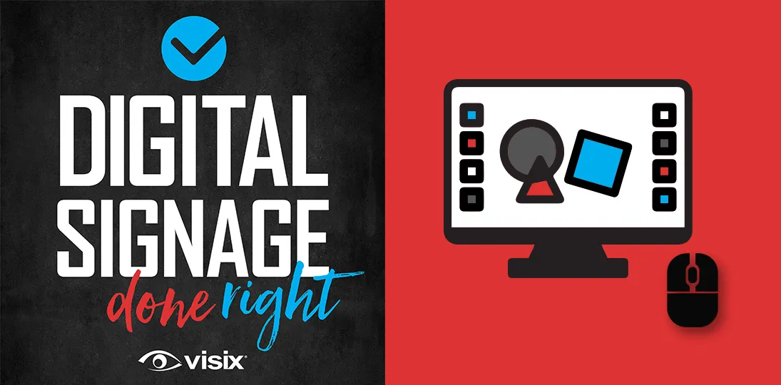
EPISODE 102 | Host: Derek DeWitt, communications specialist for Visix
Whether you’re designing for digital signage software, PowerPoint presentations, social media or downloadable resources, you’ve got to nail the basics to break through to your audience. In addition to good graphic design, you need to understand your audience and the context of your messaging to communicate effectively.
In this episode, we give you nine practical digital design tips you can start using today to attract more viewers, engage them longer and ensure your communications are motivating them to act.
- Understand how knowing your endpoint resolution is crucial
- Explore six basic design principles (contrast, colors, fonts, etc.)
- Learn to organize visual information for more impact
- Hear how colorblindness, eye strain and ADA guidelines affect designs
- Discover multiple ways to get your audience to interact and provide feedback
Subscribe to this podcast: Podbean | Spotify | Apple Podcasts | YouTube | RSS
Download our handy infographic to take these tips with you.
Transcript
Derek DeWitt: Your digital resources have to be clean and concise, but also grab attention at a glance. Doesn’t matter if you’re updating old PowerPoints or you’re adapting print designs or you’re just creating new digital signage content from scratch. There are a few things that you have to keep in mind. And we’re also aware that not everybody is a designer or has designer training. So this episode of Digital Signage Done Right is here for you. Thank you everybody for listening to this episode of the podcast. And don’t forget that you can subscribe and follow along with a full transcript with lots of handy links on the Visix website. Just go to Visix.com/Resources/Podcasts.
So, while we’re mainly talking about digital signage design here, the advice is really applicable to any digital resource. That could be an ebook; it could be PowerPoint slides; it could be social or intranet posts. It could be memes; it could be anything at all. Each one of those has their own particular little quirks, but basically all of the design device that follows can be used in any of those formats. What follows is nine pieces of advice on designing for all digital resources.
One, design for screens. Digital images are not like print images. They can be squashed or stretched if they’re not designed at the correct aspect ratio and the correct resolution for the screens that will be displaying them. That is the number one biggest problem that has been observed by the team here at Visix and elsewhere. Keep your endpoints in mind when doing all of your design work.
Most screens are HD or some kind of almost HD these days, so here’s a rough rundown of the sizes in pixels that constitute different HD qualities. 960 x 540 pixels is quarter HD (qHD), 1280 x 720 pixels is what’s known as HD Ready or Standard HD. 1920 x 1080 pixels is Full HD. And if you have really high-end displays, you can go for the 3840 x 2160 pixels, also known as Ultra HD. However, starting off with the 1920 x 1080 Full HD size usually makes really nice 16:9 images that you can also use on social media, intranets, in emails and so on. You also really don’t want to let the images get pixelated. You can’t really blow up a small image to fit a large screen. It’s actually better to start off with a larger image and then scale it down as needed. So, start off with, say, that size and then if you need to reduce it, go ahead.
However, you might also consider scaling it down to as small as you can once you’ve done the initial design work so that it still has high visual quality but isn’t too large. A file that’s just larger than it needs to be is just gonna tax your system and that doesn’t do you any favors at all. Usually, the ideal image size for something like digital signs is about two to three megabytes.
You also wanna maintain brand standards. By this I mean colors, I mean logos, even fonts sometimes. Now you might feel free to play with brand standards for a little bit while staying kind of in the same ballpark, but flexibility is gonna be determined by your corporate culture. You know, Bob’s Pizza Shack is gonna be a whole different thing than say a large international corporation like IBM. Ask your marketing department for templates or guidelines on what you can and cannot do with the brand standards. But if you have flexibility, feel free to mix it up a little bit.
Number two, design for eye strain. We’re on our screens all the time. I’m at work on a computer, I’m on my phone or tablet all the time. And now here are these other digital resources that I have to interact with. So, make sure that it’s easy on the eye. Use good contrast. This is especially true for text on a background. Make sure that your colors are complimentary. And it’s better to use less text and larger fonts so that someone can understand what you’re trying to get across to them at a glance. Generally speaking, for digital formats, sans serif fonts are easier to read than serif fonts. Serif fonts were invented for print, and they have those little lines at the top and bottom of each character to help guide the eye. But you don’t need to do that on digital signs, and in fact, serifs are often a distraction.
You should also consider people who are older maybe. Maybe their vision’s starting to go, I know mine sure is. Or maybe because we’re on our screens all day, they might be having some eye fatigue or people have diminished vision for different reasons. And colorblindness is also something to keep in mind when you’re designing for digital resources.
Also, remember that your message needs to be visible from a distance. Generally speaking, a 20 to 30 point font size is easily visible from about seven feet. But if you’re gonna have a longer distance, say 25 feet, then you’re gonna wanna scale that up to around a hundred point font. You also have to consider ADA guidelines, which you probably are in fact required to follow.
And even though this isn’t print, it’s not a bad idea to leave what you might want to call “bleed space” around the edge of your message. This creates a nice area for the eye to focus on. The bleed space or white space around the edge kind of acts as a frame almost. If you go right up to the edge of the screen, sometimes you do run the risk of your message getting cut off for whatever reason. Maybe a particular digital sign screen is not calibrated correctly or something. Also, don’t feel the need to fill every single pixel on that screen up with color. White space is incredibly useful for designers, and it gives the eye a break, making the things that you want people to notice stand out against the background.
Three, design for brevity. Use just a few elements. Make a clean design. Cluttered designs confuse the eye, confuse the audience, and frankly, as people are walking by, they’ll just tend to ignore cluttered designs. It just becomes sort of the visual equivalent of noise.
You don’t have to put everything into your design either. You can always find a way to route people to another source for more detailed information. If you do have a lot of stuff to say, instead of trying to put a bunch of text or images into that one visual, maybe design a series of resources. This is very much like design advice for PowerPoint. You don’t stick everything on one slide, but you tell sort of a story using several slides. If there’s a lot of information that needs to be imparted.
Four, design for impact. You wanna make sure that your design has a focal point in mind. What that means is one item sort of needs to take priority and draw the eye and then the eye will follow along in the way that’s most comfortable for it and take in the rest of the information in the message. What that means is you want to understand visual hierarchy.
For those of us in western cultures where we generally read left to right, the F pattern is kind of the natural line for the eye, meaning that up at the top we tend to scan left to right, and then we scan down, and then we scan left to right again and then we scan down. If you’re designing for a culture that is say Arabic or Hebrew speaking, and that means they read right to left, then you’re gonna want to use a reversed F pattern.
There’s also the rule of thirds, which is used in photography and just general image design. Imagine the message has kind of a tic tac toe board superimposed over it. So vertically it’s divided into three sections with two vertical lines and the same goes for the horizontal. So, you kind of have almost like nine boxes superimposed over the whole screen area. You want to put things on the horizontal lines and on the vertical lines, and especially where those lines intersect. This is the natural way that the human eye parses visual information at a glance.
We also have lots of other infographics and blogs and even a white paper, which is a collection of step-by-step design tips for digital signs. And we also have other design primer podcast episodes. You can find links to all this, as I said at the top in the transcript on the Visix website. Another thing to think about is that multi-window layouts are sometimes a good idea, but there’s really nothing more impactful than fullscreen messages. So whenever possible or when something is especially important, go fullscreen. Which brings us to five, design for attention. This is a visual communications medium, even though it does obviously use text.
So, some kind of movement or even animations, not too busy, not too fast, but something to kind of make the eye go, oh, what’s that? and pay attention is often a good idea. It doesn’t have to be a big swirly complicated thing that you took hours and hours to make. Sometimes it could be something as simple as just having an image drift very, very slowly in what’s known as the Ken Burns effect. Throwing in some short little bursts of video also can sometimes help draw the eye, provided it makes sense for the message that you’re trying to communicate. Judicious use of sound can also be very effective, but don’t use it in places where it’s going to become an annoyance instead of an enhancement. Again, we have other resources on our website talking about how and when to use and not use sound.
Sometimes people use various hooks to also draw attention. This could be like a news ticker along the top or the bottom of the image, a little window in the layout that’s the time, the date, the weather, maybe traffic information. All of these things can be used to make people go, oh, I wanna look at that sign because it has information that I already care about, and oh look, and here’s this other message as well.
Another thing to do is don’t let things get static. Mix it up and change it up. If you’re using a particular layout, maybe swap things around. If you’ve got a main window on the left, for example, maybe switch it over to the right sometimes. Same information, slightly different layouts makes it seem like the old information is actually new information. And feel free to go in and change some of your old designs. We call this a refresh. Remember that you’re constantly competing with your audience’s attention. Why would I look at your digital signs if they’re not interesting when I have my phone and I can have the entire worldwide web at my fingertips as I’m going about my business?
Six, design for context. Here you wanna have something like a design theme or a character or an image or even typography that just kind of grabs attention. Ooh, what’s that? When you’re presenting information from digital resources only put the key concepts on the screen. If you have more info and you have something that you want to get across in a kind of more denser design style, then make some kind of download available of some sort. Consider these almost like ads or short presentations where “less is more” is very much the design approach. So, what we’re getting at is have a multilayered approach. Don’t try to only use the digital screens to get across what you’re trying to say. Use that as a hook to make people interested enough to download the more dense information.
Another thing to think about is dwell times. Context is gonna be different for different audiences. People who are, I don’t know, for example, just passing by or shopping or something, those are short term viewers. They’re only gonna see it for maybe 30 seconds, maybe less. So, when if you think about that, you have to get their attention pretty much immediately. At someplace else, like maybe in an office where staff is working or at a reception desk, or maybe even like a cafe or coffee shop where people might be hanging around in front of the digital screens for 30 seconds or up to two minutes, well, that’s a slightly different context. And then long-term viewing, like in a waiting area, in a restaurant and things like that where people might be hanging around for two minutes, up to half an hour or even longer. Again, that’s a completely different kind of viewing context and gonna have different dwell times. So you can design things for those contexts.
Seven, design for interaction. You wanna make things interactive whenever possible. And that doesn’t just mean touchscreens. You can have links, you can have short URLs, you can have QR codes so that people can quickly grab access to a website or intranet site, or document download or whatever to have the information with them as they go about their way. But touchscreens are also a fantastic way to get people to linger longer and increase that dwell time. Touchscreens obviously make a lot of sense when it comes to something like wayfinding, especially. People are used to getting their own information no matter what it is, whether it’s something trivial or it’s something important. So, mimic that experience using the digital signs. You can also use gamification techniques to kind of pump up the interaction, make it fun to interact with your messaging and even offer real world rewards for interacting. If I have even a chance of getting something kind of interesting or cool by interacting for a short period of time with your digital messaging, well then, I’m gonna do that instead of play with my phone.
Number eight, design for feedback. You’ve gotta have calls to action. We just can’t say this enough. But you also need to test them. Do they work? Do they make sense? Are they easy? If they aren’t, then adjust them as necessary. Also, consider using some sort of analytics with your digital signage system so that you can get realtime feedback on how often a message goes up, how long it stayed. If you do have interactive designs or QR codes or things like that, how often was that call to action taken? How often did people access the website using the QR code? If you’re throwing up, for example, a QR code and a short URL and you find that the short URL was never used, well then drop it from the design. Don’t clutter things up with things that nobody wants to use.
You can also do polls and surveys provided they’re quite short to get direct feedback from your audience. And even though it does take a bit of time, a walkthrough audit is never a bad idea. That just means walking around and watching how people interact with the digital signs. Do they interact at all? Do they stop? Do they stop and linger? Do they talk to other people about what they see there? If there’s a call to action, do you see them taking that call to action? If it’s an interactive touchscreen, are they touching it? Are they using it? What are they using it for? How long are they using it for? In sales, you have the acronym ABC, always be closing. But when it comes to digital resource design, your acronym should be ABI, always be improving.
And our ninth and final tip is design for your audience. You should know who it is that is looking at your digital signs. Public-facing content is going to be different than internal-facing content. For example, demographics could be something to consider. Things that appeal to, I don’t know, middle-aged women might not appeal to young men. Think about where the signs are placed and how quickly people are walking past them. Think about this situation. Is this in a lobby? Well, that’s one kind of a space. Is it in a waiting area? Well, that’s a different kind of a space. Think about who’s in that space and why they’re there to begin with. Nobody entered the place where the digital signs are located to see the digital signs most likely. They’re probably on their way from point A to point B. So, think about who those people are and why they’re there to begin with. The digital signs are kind of an extra bonus as they go about their business. And then think about the larger context. I mean, a digital sign in a shopping center will obviously have very different purposes than one, say, in a bank.
In short, always be thinking of how it impacts your audience. And honestly, the best way to do that is to come up with your designs, and then, one day, maybe after hours when there’s nobody there, walk around and see what grabs your attention. And then get somebody different than you, someone from your target audience group, to walk around and see if the same things grab their attention.
Always be changing; always be updating; always be improving. This is a dynamic messaging system. And as I said, we’ve been talking about digital signs, but the same thing goes for anything. If you have a social media post, let’s say, that you put up and it gets no play, no interactions, no likes, no shares, redesign it. See if there’s another way you can communicate the same thing. If, in the past, short videos have worked, then maybe take that static image and make it into a short video. See if that gets more interaction. Eventually you’ll get to a point where you’ve pretty much got 60 to 80% of the method down. For my audience in these environments these things seem to work. But don’t rest on your laurels and don’t just get stuck in a rut. As I said, this is dynamic. The audience is dynamic, the content is dynamic, and so the design needs to be dynamic as well.
So there you go. Our nine tips for designing for digital resources. To recap: first off, design for screens. And these are not just digital versions of print. It’s a completely different medium. Consider things like eye strain and the fact that people are already using screens all the time. Make it brief and clean and clear. Design for impact. Design to grab and keep people’s attention. Design for the contexts that the digital signs find themselves in. Design to find some way to get people to take your calls to action and interact. Design so that you can get some kind of feedback to always be improving. And design for your specific audience or audiences so that everything is relevant and timely for them. And that is how you make a successful messaging deployment.
Thanks again for listening to this episode of Digital Signage Done Right. And as I said before, you will find lots and lots of helpful links to other resources on these same topics on the Visix website under resources/podcasts.