In the dynamic world of internal communications, your digital signage can be so much more than just a place for announcements. It’s a powerful platform for insight and action, especially when you leverage data visualizations. At its core, data visualization is about transforming complex data into clear, intuitive graphics that people can quickly understand and act upon. Whether you’re using simple tables, dynamic pie charts or real-time maps, the goal is always the same: to effectively communicate information, summarize key data and strengthen its relevance by revealing relationships in an engaging, visual way.
Data Integration: Definition & Data Sources
The term “data integration” simply means pulling information from an external application or source into your digital signage content management system (CMS). By entering the appropriate credentials and setting up where you want data to show on screens (in a table, as a visual, etc.), you’ve set up an auto-updating content stream that will show changes any time revisions are made at the source without needing to format it again in the CMS. This saves content creators a lot of time and ensures you always have the most current information on your displays.
Some of the most popular data sources for digital signage are:
- Calendar applications (Exchange, Google Calendars, CollegeNet, EMS, etc.)
- Microsoft Excel and Google Sheets
- XML and JSON
- Power BI
- CBOARD menus
- RSS feeds
In some cases, you may be working with raw data that you’ll need to format for screens. However, there are also websites and applications that may already be creating visualizations, so you could simply point to a URL to show ready-made content.
Why Data Visualizations Matter for Your Internal Audience
People are inherently visual, so when it comes to understanding progress and inspiring action, visuals are king. Showing your audience “we are here” and “we want to be here” through performance metrics is a fundamental step toward achieving goals. It triggers emotions like motivation, competitiveness and a desire for closure, all of which can directly impact behavior.
Your employees want to be kept in the loop, and today’s workforce expects a level of transparency. Digital signage is a powerful tool for achieving this by getting everyone involved in understanding organizational performance and improving productivity.
Consider these impactful applications:
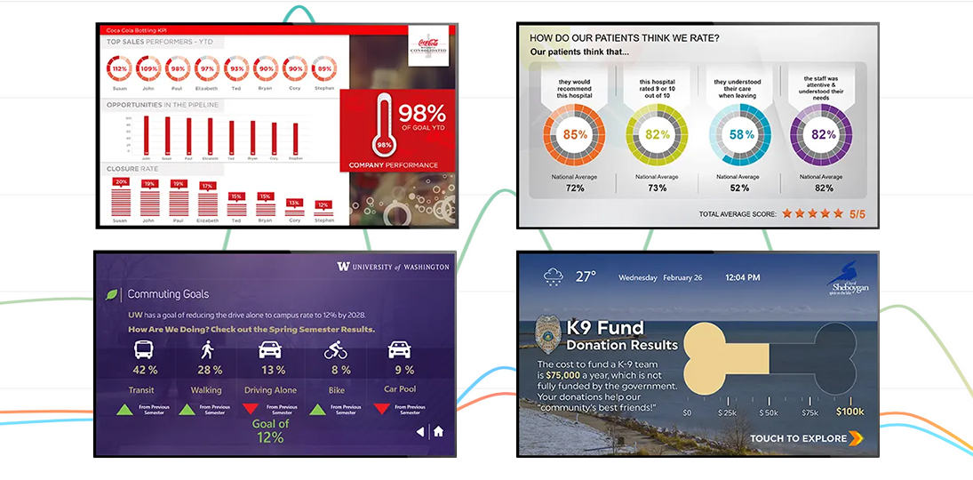
- Performance Statistics: This is a popular and highly effective use of data visualization. Displaying call center statistics, registration numbers, event attendance, poll results, program contributions or sales figures directly ties individual efforts to overall targets. By illustrating progress and outcomes on screens, you can even foster friendly competition between teams, leveraging principles of gamification. Just remember to tie these efforts to meaningful rewards that truly motivate your staff.
- Key Performance Indicators (KPIs): KPIs are crucial performance measurements tied to strategic goals. They should be SMART: Specific, Measurable, Achievable, Relevant and Time-Targeted. Displaying relevant KPIs, whether it’s days without incident in manufacturing, fundraising progress for a local charity or sales figures in the front office, helps employees feel included and intrinsically motivated to reach shared goals.
Here are some examples of KPIs and statistics you can show on your digital signs to engage your audience and keep them up to date:
- Marketing & Sales
- Sales quotas and targets
- Average profit margin
- Sales by lead
- Sales by region
- Cost per lead
- Human Resources
- Employee turnover
- Analysis of cross-team functionality
- Employee satisfaction
- Absenteeism (Bradford Factor)
- Training return on investment
- Finance
- Stock data
- Revenue vs. target
- Accounts receivable DSO
- Return on equity
- COGS trends
- Schools & Colleges
- Test scores
- District or national rankings
- Skills and literacy levels
- Enrollment and graduates
- Athletics standings
- Manufacturing
- Safety compliance
- Quality assurance
- Cycle time and cycle time ratios
- Inventory levels
- Order tracking/delivery time
- Government
- Citizens served (queuing data)
- Customer satisfaction ratings
- Time to completion
- Call center/phone line stats
- Local business engagement
- Healthcare
- ER wait times
- Patient census
- Average length of stay
- Staff Certifications
- Revenues for on-site services
- Hospitality
- Guest satisfaction scores
- Occupancy rates
- Meeting space revenues
- Concierge services
- Spa, restaurant and shop sales
Dynamic Visualizations: Beyond Static Graphics
While static graphics are useful, the true power of digital signage lies in its ability to display dynamic, real-time data. This is where data feeds meet powerful visualizations, often leveraging the Internet of Things (IoT) where machines communicate with one another to deliver timely information directly to your screens.
- Interactive Dashboards: Dashboards are incredibly versatile tools for visualizing complex data, presenting information visually with charts and graphs that are easy to understand at a glance. They keep information up-to-the-minute fresh and can highlight negative trends that need immediate correction. This saves time by replacing multiple reports with instant, organized visual data.
- Energy Dashboards: A prime example, these interactive visualizations constantly update and display a building’s electricity, water, heating and cooling consumption. When building inhabitants are shown daily energy use, consumption can drop by as much as 15%. This fosters behavioral change and environmental consciousness. You can combine these visuals with reminders like “Turn off the lights when you leave” to maximize impact.
- Beyond Energy: Dashboards aren’t limited to energy. They can display anything measurable: real-time call center stats to encourage faster call answering or higher approval ratings, or even Fitbit data for wellness campaigns. There’s almost no limit to the types of data that can be shared.
- Data-Triggered Content: This is where automation truly shines. Digital signage software can automatically update on-screen information and artwork when specific conditions are met. Not only will text from a data feed update automatically as the source data changes, but images can also update based on conditions you set in advance.
- Automated Artwork Changes: By combining simple widgets, you can set up artwork changes based on numbers, words, times or other mapped data elements. Probably the most common use of this is showing different weather icons depending on the forecast, but there are a number of options:
- Numerical Triggers: For a holiday food drive, a thermometer graphic can automatically fill up as current donation numbers are entered into an Excel spreadsheet. This works for any numeric initiative, like total closed service calls or finalized sales.
- Time Triggers: Instantly show which meetings are complete, in progress or coming up with color-coded icons. Countdown images can change as an event or deadline approaches.
- Text Triggers: Your system can automatically show one photo if a data source contains the word “red,” and another if it says “blue.” This is handy for seasonal backgrounds.
- Contextual Graphics: A campus café ad could show a hot coffee in the morning, a salad at lunch and snacks in the afternoon, all triggered by the time of day.
- Automated Artwork Changes: By combining simple widgets, you can set up artwork changes based on numbers, words, times or other mapped data elements. Probably the most common use of this is showing different weather icons depending on the forecast, but there are a number of options:
Best Practices for Designing Data Visualizations
To ensure your data visualizations are impactful, consider these design principles within the context of your overall communications plan:
- Define Your Goal: What is the purpose of the visualization? Is it strictly conveying statistics, meant to persuade, or designed to provoke a specific emotion or behavior?
- Context is Key: Is the information brand new or supporting previous communication? Set measurable goals before you start designing and determine success measures in advance.
- Clarity and Simplicity: Don’t overcrowd your visual with too much data. Using multiple visualizations in a series is better than one that is too cluttered to understand. Ensure your key information is obvious and clear.
- Design for the Eye: Think about where the eye naturally goes on the display and keep basic design principles in mind like color, contrast and juxtaposition.
- Data Integration: If your data source has multiple fields, only show those items that are relevant to your audience. And set refresh rates at a relevant page. If your data only updates once per day, you don’t need to refresh every hour.
By integrating well-planned, well-designed data visualizations into your digital signage strategy, your communications team can provide relevant, timely and easily digestible information all day, every day. Your audience will appreciate the transparency, and you’ll find that people will be more likely to change their behavior and engage with your displays when they clearly see the impact their own actions have on the organization.
Maximizing Impact: More Auto-Updating Content
Imagine your digital signs acting as dynamic information hubs, always displaying the most current news and information. This is the core benefit of auto-updating content. Instead of creating static messages that quickly become outdated, your screens can seamlessly pull information from various sources and update it in real time. This keeps your audience informed and helps your organization remain agile in its internal communications.
Here are some types of auto-updating content you can easily integrate with your digital signage software, whether or not you choose to use data visualizations. Although some of these use external data sources, you can also pull many of these in with a simple content subscription:
- Weather Forecasts: Everyone checks the weather. Displaying local or even specific regional forecasts keeps your audience informed about their immediate environment. It’s a simple yet highly effective way to provide daily utility.
- News Feeds: Whether it’s internal company news, industry headlines or general news, a news ticker or message feed ensures your audience is always up to date on important developments. You can pull from RSS feeds, dedicated news services or even your internal intranet news page.
- Event Schedules and Calendars: This is a game-changer for organizations with frequent meetings, events or classes. By linking your digital signs to your existing calendar application, schedules automatically populate and update. No more manually changing times or room numbers; if a meeting is canceled or moved, your signs reflect it instantly, avoiding confusion and saving both organizers and participants time.
- Webpages and Intranet Portals: Displaying entire webpages or specific sections of your intranet allows you to leverage existing resources directly on your screens. This is perfect for showcasing things like employee benefits portals, training resource pages or departmental information that lives online.
- Social Media Feeds: If your organization has an internal social media presence or relevant public accounts, displaying live feeds can foster community and keep employees engaged with ongoing conversations and campaigns. This adds a dynamic, social element to your digital signage.
- Queuing Systems: For areas with lines, digital queuing systems displayed on screens offer significant benefits. By showing current tickets being served, who’s next and available counters using attractive data visualizations, you can reduce perceived wait times and increase efficiency.
- Transportation Mapping: Integrating live bus and shuttle mapping from the web or passenger information systems offers tremendous convenience and safety benefits. Display live maps near exits so people can wait comfortably indoors, tracking their ride on screen before venturing outside. Touchscreens can enhance this with zoom functionality, allowing users to interact with the map like they would on their personal devices.
The advantages of auto-updating content extend beyond just saving time on content creation:
- Increased Engagement: Dynamic, fresh content is inherently more engaging than static messages. When your audience knows the information on the screens is always current, they’re more likely to pay attention and check the displays regularly.
- Improved Accuracy: Manual updates are prone to human error. Automation drastically reduces the chance of displaying outdated or incorrect information, enhancing your credibility.
- Enhanced Relevance: Information that’s timely is relevant. Auto-updating ensures your messages hit the mark by delivering insights exactly when they’re most useful.
- Consistent Messaging: By pulling from central sources, you ensure that everyone sees the same, correct information across all your digital signs, promoting unified understanding.
Embracing auto-updating content fundamentally shifts your digital signage strategy from a labor-intensive chore to an effortlessly effective communication channel. It empowers you to deliver timely, accurate and engaging content that truly adds value to your internal communications.
The Power of Real-Time Information
The power of displaying real-time data visualizations and auto-updating content on digital signs lies in its ability to transform a static screen into a dynamic, highly relevant and invaluable tool for communication, engagement and operational efficiency. By connecting to live data sources and feeds, digital signage moves beyond simple messaging to deliver immediate, contextual value to viewers, resulting in:
- Unmatched relevance and immediacy
- Dramatically increased audience engagement
- Better audience experience and satisfaction
- Improved operational efficiency
In essence, the power of real-time information on screens is its ability to make digital signage smarter, more useful and more motivating by providing the right information to the right people at precisely the right time.