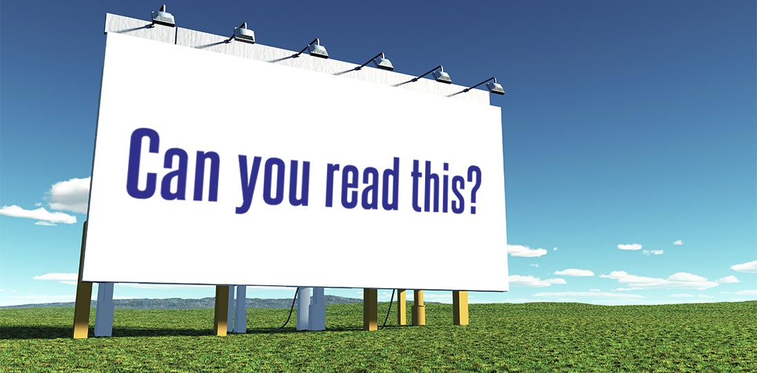
Sure, you’ve got an eye-catching image to draw people’s attention to your billboard or other signage as they drive by, but the information you want to share needs to be clear and concise or what’s the point? And the real thing to focus on here is your fonts. Choosing the right font and font style can make or break your roadside signage. There are a number of things to consider: font size, style, lower or upper case, spacing, alignment, colors, contrast with the background and the font choice itself.
Regulations & Research
Since 1935, highway signs in the United States have been standardized according to guidelines set out by the Manual on Uniform Traffic Control Devices (MUTCD) and the Standard Highway Signs (SHS) manual, published by the Federal Highway Administration (FHWA). We’ve all seen the signs: a red octagon with “stop” in white capital letters, speed limit signs on a white background with black text, yellow diamond signs with black text and icons for warnings (like “yield” or “falling rock”), interchange and highway signs on a green background with white text and so on. It may seem like a simple system, but someone had to field test and approve the exact shades of background color, whether to use upper- and lower-case letters or all caps, and which fonts to use.
All these signs have been extensively researched for the best visibility to a driver passing by at high speeds while (hopefully) paying attention to the road and other vehicles. All highway fonts are sans serif, since the serif simply adds visual complications that are unnecessary and do not actually aid the eye in the short timeframes people see the signs. But times change and as more research is done, improvements are attempted.
Roadside Fonts
In the 1940s, the FHWA set out standard fonts, mainly Highway Gothic (an umbrella term for a series of related fonts adopted by the FHWA). In the 1990s, a new font was digitally created called Interstate, which was also suitable for print and computer screens. While it has been adopted by several companies, including Citibank, Sainsbury’s, SoundCloud and the Weather Channel, the FHWA didn’t really take to it.
Then the Clearview font came along in 2004, with testing indicating that it was 2-8% more legible both at night and during the day, and many old signs were replaced with this new font. (AT&T used it for corporate signage for ten years.) But numerals weren’t as clear as in Highway Gothic and the measured improved visibility was thought to be at least partially attributable to the fact that old road signs were being replaced with new ones, and not the font itself. A bit of a battle ensued in 2009, with Clearview getting approved but not being added to the MUTCD. Then use of the font was actually rescinded in 2016. And then, based on their report, Congress ordered that it be reinstated in 2018.
And while we talk of standards, the fact is that there isn’t just one standard. The MUTCD has only been adopted in 22 states plus D.C. and Puerto Rico. Another 10 have their own state-specific font variations in use. And much of the rest of the world has a whole different system – the Vienna Convention on Road Signs and Signals, which went into effect in 1978. It’s used in many countries, but not the United States. That’s a lot of debate about fonts and should show you just how important they are!
Font Size, Color & Contrast
There are two main considerations for which font to use for roadside signage: how far away the sign is from the intended reader and how fast that person is traveling past the sign. Another thing to keep in mind is that how something looks on your computer screen is not necessarily how it’s going to look in the wild.
The United States Sign Council Federation has a 60-page report on best practices for signs, as well as a much more exhaustive 10-volume report written in collaboration with the Pennsylvania Transportation Institute from 1996 to 2010, laying out what to do in great detail. As a general rule of thumb, how far away the sign is from the reader determines the minimum heigh of the letters. It’s around one inch for every 10 feet away that the average reader will be from the sign.
For a sign with all upper-case Helvetica font, black text on a white background (the highest contrast possible), the guidelines are:
| Minimum Letter Height | Maximum Impact Distance | Maximum Viewing Distance |
| 04 inches | 40 ft. | 100 ft. |
| 10 inches | 100 ft. | 250 ft. |
| 16 inches | 160 ft. | 360 ft. (city block) |
| 22 inches | 220 ft. | 500 ft. |
| 33 inches | 330 ft. | 750 ft. |
| 43 inches | 430 ft. | 1000 ft. |
| 57 inches | 570 ft. | 1320 ft. (1/4 mile) |
As you can see, the maximum impact for a reader (which is when a font is actually able to be read by a person in motion) is quite a bit closer than the potential viewing distance. Mixing upper- and lower-case letters adds a little bit of visibility distance. For example, a mixture of upper- and lower-case letters that are four inches high would give a viewing distance of 116 feet instead of 100. Century Sign Builders in Albuquerque, New Mexico has a handy chart for letter sizes ranging from half an inch to 48 inches.
The chart above is for black letters on a white background because that’s one of the best combinations for contrast, which improves visibility. Other good combinations include white on black, black on yellow, yellow on black, or orange on black or vice versa. The worst are combinations of red and green, and red and blue. (However, adding a stroke to the letters can improve that.) Fort Wayne’s Indiana Signworks, who use data from the California Institute of Technology, have a chart you can reference with contrasts, letter sizes and maximum impact times.
Digital Roadside Signs
Digital signs are becoming very much the standard for roadside signage across the country and bring a whole new set of considerations when designing messages for these signs, like is the image static or in motion? Generally, the best fonts to use for all outdoor messaging are sans serif fonts like Arial, Calibri, Futura, Garamond, Helvetica, Tahoma, Trajan and Verdana. And the font weight shouldn’t be too light either; thin letters are harder to see from a distance. Don’t use “fancy” fonts, like Brush Script or one of the Adobe Handwriting fonts. In fact, stay away from all script or gothic fonts.
Don’t use more than two different fonts for one message. More than that just confuses they eye. It’s probably best to just use one with different sizes and weights, but if you decide to go for two, make sure they are similar or related. This makes it easier to read and also gives your design a cohesive look.
How fast someone is going past your roadside signage is also a factor. For example, if the speed limit is 35mph, the message should be visible for three seconds by passing drivers. This means the letters should be no less than seven inches tall, even as close as 100 feet. On a digital sign, that’s 18 pixels on a sign with a 10mm pixel pitch (which means the space between pixels is 10mm). It’s a complicated business, and the faster the person is passing by, the larger the letters need to be. Letters eight inches high can be seen for 1.8 seconds at 30mph but that drops to 0.9 seconds at 60mph.
A very general guideline (general because there can be several factors at play with digital roadside signage) is to use pixels: font points = 1.33333:1. This involves a bit of math. Take the character size, divide by 1.3333, convert to millimeters, then divide by pixel pitch.
Assuming the pixel pitch does not scale in any way:
| Speed | Recommended Size | Maximum Impact Size | Minimum Size |
| 35 mph | 18”, 46 px., 35 pt. | 35”, 80 px., 67 pt. | 07”, 18 px., 13 pt. |
| 45 mph | 23”, 58 px., 77 pt. | 46”, 116 px., 155 pt. | 10”, 25 px., 19 pt. |
| 55 mph | 28”, 70 px., 119 pt. | 57”, 152 px., 243 pt. | 13”, 32 px., 25 pt. |
As mentioned above, combining upper- and lower-case letter actually increases visibility. Instead of going all caps, try judicious use of bold instead. When it comes to spacing, try to keep it even. Crowding letters or words together on part of the message makes the whole thing seem uneven and out of balance. And there’s a good chance that, while people might notice there’s a message on the sign, they won’t actually dial in to receive the information because it just looks like too much trouble.
Keep in mind that people are subconsciously making the “decision” to read your message or not; it all happens in a split second. Generally speaking, it’s better to have your text a little larger than necessary than too small, so always err on the side of bigger.
Roadside Signage Design Tips
When designing content for digital signs in a building where the audience is most likely on foot, it’s common to think about an attention-grabbing image first. This is also true for outdoor screens at locations like bus stops. But when designing for roadside signage, the order gets reversed: start with the text and incorporate visual elements last.
The text is what the person will “take away” from your message, so it needs to be the focus of the entire design. You also have to assume that they will never come this way again, so you really want your information to lodge in their mind for impact and recall.
And there are other things to consider when designing your roadside signage:
- Lighting conditions – Does your sign get glare from the sun? If so, when? If it’s during peak traffic hours, simplify the message and increase the font size and contrast.
- Sign surroundings – What’s behind and next to the sign? Buildings, trees and even the open sky all add to the background of your message from the point of the viewer.
- Test it in the wild – If at all possible, create a test environment that mimics what your audience’s experience will be as closely as possible. Test and adjust repeatedly. The perfect scenario would be to get the message up on the actual sign and then drive past it yourself while listening to your favorite podcast.
Unless you own your own roadside signage, you’ll be working with an agency to place your message. Take advantage of their expertise and advice. If you can go digital, see if your agreement allows you to make adjustments over time. As with all advertising, testing and tweaking will be key.