Digital wayfinding is the use of dynamic, screen-based systems – kiosks, displays, and mobile tools – to help visitors navigate a space in real time. As our environments become more complex, the ability to navigate a physical space seamlessly is no longer a luxury; it’s a fundamental expectation. Whether it is a sprawling healthcare campus, a multi-story corporate hub, or a modern university, the transition from static to digital wayfinding represents a fundamental shift in how organizations interact with their visitors.
Wayfinding is more than just a series of signs or messages; it’s a communication strategy. It’s the process of using spatial and environmental cues to help people navigate from point A to point B without frustration. As we move further into the digital age, static plaques and printed maps are becoming relics of the past, replaced by dynamic, interactive, and mobile-integrated systems that provide real-time information. It’s time to eliminate those old ways of doing things and go digital.
Here’s what every organization should know before making the switch.
Why Your Wayfinding Signage Should Be Digital
Visitors today expect instant, accurate, and interactive information. Static signage possesses inherent limitations that can hinder organizational efficiency and damage the visitor experience.
The Limitations of Static Signage
Static signs are permanent, inflexible, and expensive to maintain. Every time a tenant moves, a department is renamed, or a wing is renovated, a physical sign must be removed, redesigned, manufactured, and reinstalled. This creates a lag time where information is incorrect, leading to visitor confusion. Furthermore, static signs cannot provide context. They cannot tell a visitor if a room is currently occupied, if an elevator is out of service, or if there is an emergency happening in the building.
The Digital Advantage
Digital wayfinding solves these issues through being agile. By utilizing a centralized Content Management System (CMS), updates can be pushed to dozens of screens across a campus in seconds. This ensures that the information is always current. Beyond simple directions, digital systems offer:
- Real-Time Integration: Pulling data from event calendars (like Office 365 or Google Calendar) to show live room availability.
- Emergency Overrides: Turning every navigation kiosk instantly into an emergency alert system that directs people toward the nearest safe exit.
- Reduced Cognitive Load: Using animation and 3D modeling to make maps easier to interpret than flat, 2D printed diagrams.
10 Benefits of Digital Wayfinding
When evaluating the ROI of a digital wayfinding project, it is essential to look beyond the hardware. The benefits ripple through every department, from facilities management to human resources.
- Enhanced Visitor Experience and Reduced Stress: Navigating a high-stakes environment, like a hospital before surgery or a courthouse for a hearing, can be inherently stressful. Digital wayfinding empowers the visitor, providing a sense of agency. By offering a clear, searchable path, the system lowers anxiety and creates a positive first impression of the brand.
- Significant Long-Term Cost Savings: While the initial investment in screens and software is higher than vinyl lettering, the lifecycle costs are significantly lower. You eliminate the recurring costs of printing, shipping, and labor associated with updating physical signs.
- Increased Staff Productivity: In facilities without clear wayfinding, frontline staff often become unintentional concierges. Studies have shown that hospital nurses and receptionists spend a significant portion of their week giving directions. Digital kiosks handle these routine inquiries, allowing staff to focus on their primary clinical and administrative duties.
- ADA Compliance and Universal Accessibility: Digital systems can be designed with accessibility at the forefront. This includes wheelchair-accessible route filtering, high-contrast modes for the visually impaired, and interactive elements positioned within the ADA-mandated reach range.
- Multi-Language Support: In a diverse society, your visitors may not speak the local language. Digital wayfinding allows users to toggle between multiple languages instantly, ensuring that every visitor is informed and feels welcomed.
- Branding and Aesthetic Appeal: A sleek, interactive kiosk signals to visitors that your organization is innovative, forward-thinking, and invested in the user experience. Tailor the enclosure to your brand for instant recognition, even from a distance.
- Data Integration and Automation: Digital wayfinding doesn’t have to be a standalone service. It can be integrated with your existing tech stack – Excel for staff directories, EMS for room bookings, and even local weather and transit APIs to provide a “concierge” level of service.
- Promotion of Events and Services: When a kiosk is not being used for navigation, it serves as a powerful digital signage platform. You can use the screen real estate to promote upcoming events, cafeteria specials, or organizational milestones.
- Real-Time Analytics: Unlike a static map, a digital kiosk can tell you what people are searching for. If “restroom” or “Radiology” is the most searched term, you can use that data to place “quick-link” buttons on the home screen to streamline the user journey. When it comes time to renovate an area, you’ll know where to start.
- Seamless Mobile Handoff: Perhaps the greatest benefit is the ability to bridge the gap between the kiosk and the smartphone. Visitors can find their destination on the big screen and then “take it with them” via QR code or SMS.
Exploring Digital Wayfinding Options: Which is Right for You?
Organizations have varying needs based on their floor plan, budget, and visitor demographics. There are three primary tiers of digital wayfinding:
Static Digital Directories
This is an entry-level option. It uses standard digital signage screens to display a rotating list of names, room numbers, and a “You Are Here” map. While users cannot touch the screen to interact, these are highly effective in lobbies and elevator banks to provide quick but high-level orientation.
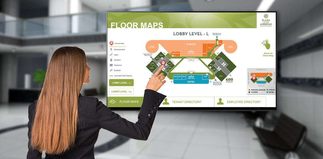
Interactive Touchscreen Kiosks
This is the most popular choice for modern facilities. These kiosks allow for:
- Keyword Search: Search directories by name, department, or service.
- Dynamic Pathfinding: An animated line draws the path from the kiosk to the destination.
- 3D Perspective: Multi-floor buildings are easier to understand when shown in a 3D “tilt-axis” view.
Wayfinding Beyond the Screen: Mobile and Hybrid Options
This option removes the hardware barrier entirely or can complement your screens and kiosks. By using HTML5 responsive design, the wayfinding experience is delivered directly to the user’s phone. This is often triggered by scanning a QR code at the entrance of a building. That’s where the “mobile handoff” becomes essential. A visitor may find their destination at the front desk, but they still have to navigate five hallways and two elevator banks to get there.
The QR Code “Take-it-With-You” Feature
By placing a unique QR code on the interactive map for every destination, the system can generate a mobile-friendly URL. When the user scans it, the map and the turn-by-turn directions are loaded onto their phone. They no longer have to struggle to remember the route as the proceed; they simply follow the instructions on their device as they walk.
SMS Integration
SMS integration is another option for visitors. They enter their phone number to receive turn-by-turn directions as text messages. This ensures a high adoption rate across all age groups.
10 Steps to Successful Digital Wayfinding
A successful wayfinding rollout requires more than just buying software. It requires a structured, strategic approach. Follow these ten steps to ensure a smooth implementation:
- Define Your Team: Identify stakeholders from IT (security and connectivity), Facilities (power and mounting), and Marketing (branding and UI design).
- Set Clear Goals: What does success look like? Are you trying to reduce late appointments? Are you trying to modernize a legacy building? Establish your KPIs early.
- Audit Your Audience: Who is using the system? Students? Elderly patients? Tech-savvy professionals? Your UI design must accommodate the widest range of tech literacy among your audience.
- Determine Hardware Placement: Walk your facility to find decision points. These are the spots where a visitor is forced to make a choice (e.g., a T-junction or an elevator bank). This is where your kiosks or screens belong.
- Gather High-Quality Assets: You need accurate architectural floor plans. Ensure your room numbers and department names are standardized across your database.
- Select Your Design Style: Choose between 2D (clean and simple) or 3D (more realistic and immersive). 3D is generally preferred for multi-building campuses.
- Prioritize ADA and Inclusivity: Ensure your maps include “Accessible Routes” that bypass stairs and heavy manual doors.
- Enable Mobile Integration: Decide whether you want a web-based “Take-it-With-You” solution or a full-scale mobile app with beacons.
- Rigorous Testing: Before the public launch, conduct “wayfinding trials.” Give a stranger a destination and watch them use the kiosk. If they struggle, your UI needs refinement.
- Analyze and Update: Use backend analytics to see “dead-end” searches (where people searched for something that wasn’t there) and update your directory accordingly.
Design Best Practices: How to Do Wayfinding Right
The design of a wayfinding system is where space psychology (how interiors impact our behavior) meets user interface design. If the map is cluttered, it is useless.
Color-Coding and Visual Hierarchy
Humans process images 60,000 times faster than text. Use color-coding to differentiate wings or floors. If the North Wing has blue accents in the physical carpet and wall paint, use blue on the digital map. This creates a visual bridge that confirms to the user they are in the right place.
The You Are Here Marker
This is the most important element on any map. It must be prominent, clearly labeled, and oriented to the user’s perspective. If the user is facing North, the map on the screen should be oriented North.
Simple Iconography
Use standard, universal symbols for high-traffic areas. A silhouette of a man and woman for restrooms, an “$” for a ATMs, and a fork/knife for a cafeteria. Icons transcend language barriers and allow for quicker scanning of the interface.
Keeping the UI Clean
Avoid the temptation to fill the screen with too much information. A home screen should have large, easy-to-tap buttons for the most common destinations. Save the detailed directory for the search function.
Integration: Making Wayfinding Part of the Ecosystem
Modern wayfinding should be a “living” system. By connecting your wayfinding to other data sources, you create a more powerful tool.
Calendar Integration
If a conference room is booked, the wayfinding kiosk should display the name of the meeting. This prevents “meeting room poaching” and helps attendees confirm they are at the right door.
Shuttle and Transit Tracking
For large campuses, integrating GPS data from campus shuttles allows visitors to see exactly when the next bus or shuttle is arriving at the stop nearest to the kiosk.
Social Media and News
In idle moments, the wayfinding screen can display curated social media feeds or local news, engaging frequent visitors with fresh, interesting content.
Wayfinding as a Strategic Asset
Digital wayfinding is far more than a technical upgrade to a lobby; it is a commitment to easing the visitor’s journey. By combining hardware, intuitive design, and mobile connectivity, organizations can transform a confusing, labyrinthine facility into a navigable, welcoming environment.
The transition to digital is not a one-time project, but the beginning of a long-term strategy. As your organization grows and your facility evolves, your wayfinding system will grow with you. It provides a scalable platform that reduces operational friction, enhances brand loyalty, and, most importantly, ensures that no one is ever truly lost.
In the end, the most successful wayfinding systems are the ones that visitors barely notice because they work so perfectly. By following the best practices and implementation steps outlined in this guide, you can ensure that your facility provides a clear, stress-free path forward for every person who walks through your doors.
Quick Takeaways: Digital Wayfinding FAQ
How does digital wayfinding provide a tangible return on investment?
Beyond eliminating the recurring costs of printing and installing physical signs, it significantly increases staff productivity by offloading routine directional inquiries to self-service kiosks.
Can digital wayfinding integrate with our existing office or scheduling software?
Yes, modern systems can sync directly with tools like Office 365, Google Calendar, and directories to ensure room schedules and staff locations are always updated in real time.
Is digital wayfinding fully compliant with ADA accessibility standards?
Yes. When designed with inclusivity in mind, digital wayfinding includes features like filtering a route for wheelchairs and ensures interactive buttons are placed within the mandated reach range.
How difficult is it to update the directory when a tenant or department moves?
Updates are near-instant; you simply change the information in a central web-based dashboard, and every screen across your entire campus reflects the change immediately.
Can wayfinding screens be used for purposes other than navigation?
Absolutely. When the screens aren’t being touched, they serve as powerful digital signage for emergency alerts, event promotions, cafeteria menus, or real-time transit updates.