
Digital signage allows targeted content to be published over a wide physical area. Layouts for digital signs can incorporate lots of attractors like weather, date and time, and news feeds to entice viewers to read your regular messages. But too often, screens get jammed so full of stuff that the real message gets lost in all the clutter, or the screens just get ignored altogether.
Most organizations use multiple content zones on their screens. This can be a good idea, depending on several factors. But putting too much on your screen is as bad as putting up a sloppy design in a single content block – people can’t read it. If you cram your layout with lots of different data, how does the viewer know where to look? It’s better to use a simple layout and change the content in your blocks more frequently than to try to put everything on the screen at once.
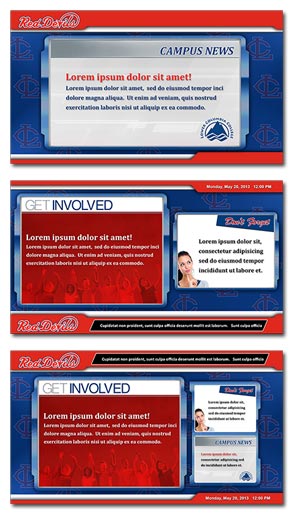
Consider using a layout with your logo, date and time, and just two content blocks. This will clean up the screen and let you have bigger content blocks, so your messages are more readable. Adding a ticker is no problem, since it takes up very little screen real estate and is moving along the top or bottom of the screen. Switch layouts every hour to a single 16:9 content block with a ticker underneath.
Timing is Everything
Digital signage is a “glance medium” – you have just a few seconds to get someone’s attention and engage them. People almost never just stand in front of a digital sign, watching it scroll through its messages. They’re on their way somewhere else and have other things on their mind. And the fact that people are almost always in motion and preoccupied when they encounter your digital signs reduces your window of opportunity down to something like one to two seconds. That’s it – that’s all the time you have to get someone interested enough to focus their attention and take in enough of your message to decide if they’re interested in it and follow the call to action.
Now, that’s one to two seconds each time that person walks past a single display. The more digital signs they encounter on their journey showing the same messages, the more chances you have of borrowing their attention for a few moments.
Of course, different environments might have different types of viewers. You might have people just passing by, but you also might have displays in areas where people are waiting (like at an elevator bank) or even hanging around longer (like a waiting room).
This doesn’t mean that you should only display messages for two seconds. Somewhere between 10 and 20 is standard, though a lot depends on what is in the message. A common design principle is that the person who actually designed the content (and so is familiar with what it says) should be able to read the text five times while that particular message is on the screen. Others say the designer should be able to read the message backwards in the time it’s up on the screens. This mimics how long someone who is unfamiliar with the content needs to take it in and comprehend it.
It’s better to have fewer messages in a playlist that then repeats frequently. If you have 10 messages that are up for 15 seconds each, that’s still 150 seconds or two and a half minutes, before a particular message gets shown again. That’s just too long for anything except a lounging area. Better to have five or six that show for 10-12 seconds each, giving you a cycle of 50-72 seconds before a message repeats. YOU then rotate out that playlist for another playlist several times a day.
Switch It Up
People today are much better at multitasking than in the past, so having messages and other content in multiple content blocks can increase the chances of grabbing someone’s attention, provided it’s not too busy. But why stick with just one layout? If you use the same layout all day every day, people will become used to it and pay less attention over time. Just like having several playlists in rotation throughout the day or week, think about using more than one digital signage layout. To get and keep people’s attention, your content has to be presented in dynamic, changing formats.
Different audiences need different layouts. If you have a screen in an area where people pass by quickly, you have a better chance of them noticing a single announcement than trying to decipher three message blocks and a ticker in just a few seconds.
On the other hand, if you have an area where viewers spend more time, like a lobby or lounge, you can put more on screen since they have more time to read and comprehend more information.
Passing By
- Viewing time = 01-30 seconds
- Display location: in a hallway, near an entrance with no lobby, elevator bay, people walking by and not stopping.
- 1-block layout with date/time stamp and/or current conditions weather. No video, no ticker, short graphic messages only.
Waiting
- Viewing time = 30-120 seconds
- Display location: short lines for cashier or reception desk, people stopping for brief periods of time.
- 2-block layout with date/time or weather (maybe also ticker). Short videos and short graphic messages.
Lounging
- Viewing time = 02-30 minutes
- Display location: reception with seating, lounges, cafeteria, break room, anywhere there is seating.
- 3-block layout with everything. No restriction on content types and layout complexity, add live TV for 10+ minute waiting areas.
Having said that, a lot of digital signage is used in passerby environments. A single full-screen message that has a beautiful image, nice colors, clean lines, easy-to-read text and clear yet concise information can be incredibly powerful. Done right, such a message can literally stop someone in their tracks, making them take in the content in its entirety, and possibly even delaying them long enough to get another message in front of them.
But don’t just do one thing all the time. Mix it up and keep it fresh. Use a variety of layouts to vary the impact on the eye and keep things interesting.
Three content zones plus attractors is often too much. Use such a layout sparingly, and only if the various messages, schedules or other content shown at the same time is extremely clean and simple – each one should only take 1-2 seconds to read and understand.
Better is to vary between layouts with two content blocks and full screen messages. Mix and match attractors as well, so that sometimes weather is displayed, sometimes a ticker, sometimes the clock and date, sometimes just the playlist of messages. Even though almost no one is going to be sitting or standing in front of your screens for minutes at a time (except in waiting areas, of course), you can keep their attention longer with good designs. Keep it always changing, always new, always exciting and fresh. It’s better to have seven simple layout designs rotating throughout the day than one that has seven different content zones.
Simplify what’s on the screen at any given moment but diversify your layouts so each one is uniquely suited to the main message you’re trying to get across. That’s using digital signage for maximum impact. By varying your layouts and reducing the number of content zones, and including some arresting and eye-catching full screen content, you will almost certainly increase the chances that your messages cut through the clutter to attract viewers and inspire your target audience to follow your call to action.
Attract, Don’t Distract
Try this experiment: look at a photo of Times Square for 10 seconds, then close it. Now try to name as many brand names as you can remember from your quick peek. Chances are, you will remember surprisingly few. There’s so much going on that your brain can’t really process it. And when the input to a system exceeds that system’s processing capacity, that’s called information overload.
Many designers use multi-zone layouts with several attractors to try and get the audience to slow down and focus attention on the screen. Something like, “oh look, it’s going to rain later, well I’m glad I know that, and what’s that other message say about signing up to the 401K?” A nicely designed weather widget is a great way to get attention, as is a nice big clock with the current time and the date and day of the week. People will become used to checking your digital signs for this information throughout the day, increasing the chances of them being exposed to your content. Some organizations add in local traffic streams later in the day, which is also something working in-office will probably find useful and start to rely on.
News tickers are another tool in the digital signage design arsenal. People will slow down a bit to see what’s going on in the world and so increase the amount of time they’re exposed to the screen and its content.
Because you never know what’s going to pique someone’s interest, some designers use what we might call the shotgun design approach – throw a whole bunch of stuff out there on the screens and hope something grabs a particular person’s attention. As a result, you can often see digital signs displaying three, four or more separate content zones, each with its own message, plus a new ticker scrolling across the bottom, plus an animated weather widget in one corner and an animated clock and calendar in the other, sometimes a video feed or stream as well…and suddenly the digital sign is starting to resemble Times Square. There’s just way too much going on for any of it to be effective.
Eyes Move to Movement
We basically evolved to notice movement and respond to it. That’s why digital signage designers often put in tickers or a live TV feed. The movement on screen draws the eye, even as someone is just walking past.
And yet, as we’ve said, those might not be appropriate in some locations and for certain kinds of audience. That’s why adding animation can do a lot to get the attention you need to make your digital signage successful.
Animated digital sign layouts usually use a subtle texture, pattern or lighting effect that catch the eye every 30 seconds or so. You can also use this feature to animate your logo or have an interactive hot spot glow periodically to entice viewers.
If you’re showing lots of videos in your content blocks, you’ll want to keep the layout animation very subtle or stick with the still design. In general, you should only have one prominent animation on screen at any time.
Even something as simple as the Ken Burns Effect can be effective. This is simply a slight panning or zooming used on still images.
Also, consider the placement of screens. If they’re mounted high up, your animation may need to be more obvious to be seen. If it’s on a touchscreen kiosk or a display down low, it can be more subtle.
You still need to consider the animation within the context of the entire screen design and the environment in which the screens sit. As with all content, animated layouts can either help or hinder – it’s all in the design and the scheduling.
Although animation draws attention, too much animation can confuse the eye and muddle the message. If you run a TV channel in one block, a video in another, animated weather in the corner, and then add a busy video as your background, your viewers might get seasick looking at the screens.
Brand Standards Standardize
With so many different ways to layout your digital signs, how can you keep any consistency? One way is with brand standards.
Your company has worked hard to establish an identity. It’s important to carry over those brands standards for your digital signage content, too. Your organization’s identity is its public face, it’s “look”, and should be considered when designing content for digital signage or presentations. You want to put forward a united “brand” in both internal and external communications.
Your digital signage will improve drastically in quality if you use a standardized array of colors, fonts and styles. Side-by-side presentation of your messages will automatically blend and please the eye if you are choosing from a predetermined set of design elements.
This doesn’t mean the end of uniqueness and creativity. Bring in outside designs and graphics that complement and offset identity components for greater impact. You can play with layouts and craft interesting, effective communications while incorporating a few standard themes.
Many organizations publish identity guidelines that you can reference. If you don’t have access to guidelines, some common sense goes a long way.
Ask yourself the following questions:
Do you need to include your logo?
- If so, make sure you have a high-resolution copy of the logo to work with.
- If your logo has a color background, eliminate the background or design to match that color.
Do you have standard colors to work with?
- If you have PMS print colors defined, start with those and find their equivalent RGB colors for digital designs.
- If you don’t have them already, pick six to eight colors that complement your brand colors so you have more to work with.
What fonts should you use?
- You can still use fun fonts to make your communications exciting but remember to incorporate approved text styles where you can.
- Remember not to use too many fonts in your design. No more than 2 fonts on a single message is a good rule.
Some organizations have an image library that you can choose from, and your internet or intranet sites can be a good resource for graphics that have already been through the approval process.
In addition to brand standards, you can also use color systems within your overall themes. For example, if your logo is blue and green, you could standardize blue backgrounds for general information, green for important announcements, and red for security and alerts. These color cues help your audience easily recognize the messages they’re interested in, and over time, you can train viewers to look for colors related to specific types of information. This is especially important when it comes to alerts, which most organizations use red for.
If you’re not sure about your organization’s brand standards, your PR or marketing department is the place to start.
Using approved identity components and mixing in complimentary design elements will improve the quality of your visual messaging while solidifying your organization’s identity with viewers – two communications goals easily met with a little preparation and creativity.