The first thing a visitor sees when they walk into your building says a lot about your organization. For decades, that “thing” was a brass or acrylic plaque bolted to the lobby wall. It worked. It just didn’t work well. It was handsome enough when first installed, slightly out of date within a year, and a minor renovation project every time a tenant moved in or a department reorganized.
Digital building directories have quietly become the new default for offices, campuses, hospitals, government facilities, and mixed-use properties, and the reasons go well beyond “screens look modern”. A digital directory is a communications platform that can wayfind, advertise, broadcast emergency information, display real-time data, and update itself from a spreadsheet, all while costing less to maintain than the static signage it replaces. For IT teams, facilities managers, and the executives signing the purchase order, that combination is genuinely hard to ignore.
This post walks through what a digital directory actually does, the practical advantages over traditional signage, the design and technical considerations worth knowing before you buy, and a few things that have shifted in 2026 worth factoring into your planning.
What Is a Digital Building Directory?
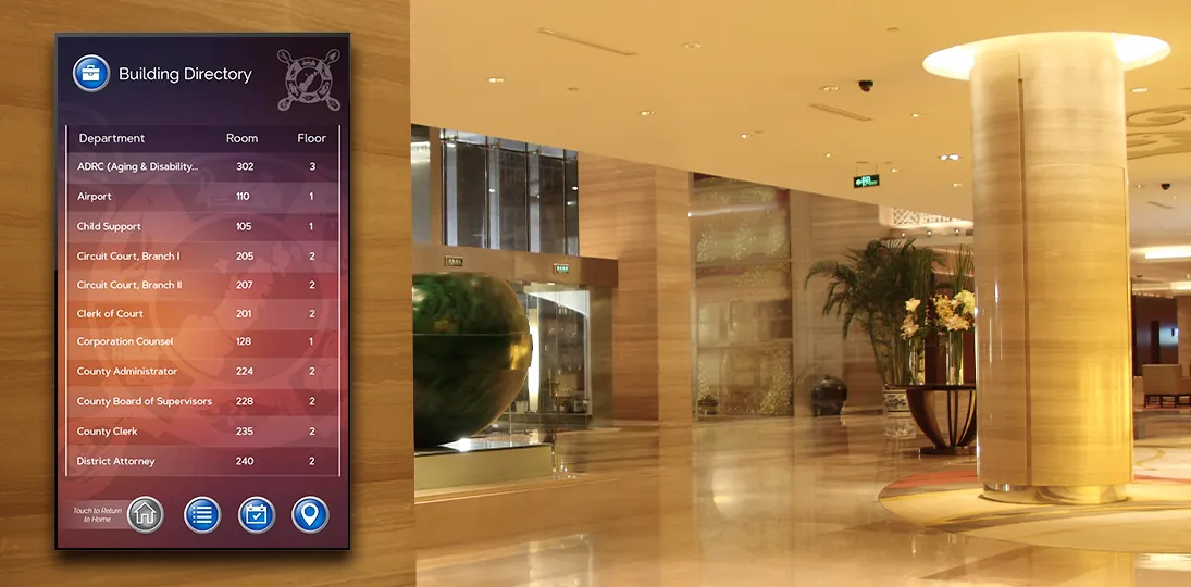
A digital building directory is a software-driven display, often touchscreen, that shows tenant or department listings, provides wayfinding, and updates automatically from a live data source. Today, though, the term covers a wider range than it used to. At the simple end, a digital directory is a flat-panel display in a lobby showing a tenant list, a floor index, a department roster, or something similar. At the more sophisticated end, it’s a touchscreen kiosk tied into a content management system (CMS), pulling tenant data from a live source, offering turn-by-turn wayfinding, integrating with building access or visitor management, and doubling as an emergency notification surface when something goes wrong.
Most organizations land somewhere in the middle with a directory that’s primarily informational but capable of stretching when needed. That flexibility is the whole point. Unlike a plaque, a digital directory isn’t a single-purpose object. It’s a digital canvas, and what it shows is entirely up to you.
Benefits Over Static Signage
The benefits get cited so often in the digital signage space that they can start to feel like marketing wallpaper. But they are also genuinely true. The point isn’t that any single one justifies the switch; it’s that they compound and reinforce one another.
| Factor | Digital directory | Traditional (static) signage |
| Updates | Edits in a few clicks, or zero clicks when reading from a live data source; every screen updates at once | Reprints, replacement panels, and after-hours installation for every change |
| Attention and recall | Motion, color, and timed content cycles draw the eye (industry figures cite up to 400% more views and ~83% recall) | Fixed content that’s easy to walk past |
| Wayfinding | Floor maps, interactive zoom, turn-by-turn directions, and QR handoff to the visitor’s phone | Listings only; no way to show the route |
| Interactivity | Search by name, department, service, or room number, plus check-in, feedback, and surveys | None; passive viewing only |
| Visitor experience | Self-service that respects a visitor’s time and signals a thoughtful organization | Reliant on a receptionist when listings fall short |
| Revenue potential | Same hardware can run amenities, sponsorships, and available-space promotions | No revenue capability |
| Visual refreshes | Rebrand by pushing a new template to every screen | Replace the panel to match a new look |
| Expansion | Add screens to the existing CMS as you add wings, floors, or tenants | A new signage program for each addition |
| Sustainability | Higher upfront cost, but eliminates recurring print runs and material waste | Recurring print waste and emissions with every change |
| Accessibility | Adjustable contrast, audio alternatives, and multiple languages to meet ADA and WCAG 2.2 | Fixed type, contrast, and language |
Design Principles That Actually Matter
Most digital directory failures aren’t hardware failures; they’re design failures. The screen works fine. The interface just makes people feel stupid, or makes information hard to find, or looks like it was put together by someone who had never used a touchscreen. A few principles consistently separate directories people enjoy using from ones they avoid.
- Keep text short. Three or four words are usually enough for a label or button. Anything longer becomes a block of text that’s hard to scan, especially from a distance. Save the details for the secondary screen, after someone has indicated they want it.
- Make text large enough to read from where people stand. This sounds obvious. It’s also the single most commonly violated rule in directory design. Test from a realistic distance, not from your chair at your workstation.
- Design intuitive navigation. Controls should do what they look like they do. A back button should always go back. A home button should always return to the top level. Users shouldn’t have to learn your interface; they should be able to predict it based on what they already know from phones, web browsers, and ATMs.
- Be consistent. If the back arrow lives in the bottom-right corner on one screen, it lives in the bottom-right corner on every screen. Inconsistency might feel minor in design review, but it can confuse your intended audience.
- Keep the screen clean. A directory that crams in time, weather, news, social feeds, an organization chart, and a video loop is a directory that’s harder to use. Pick the supporting elements that genuinely help – current time, a small weather widget, a discreet messaging area – and resist the urge to fill every bit of the screen.
- Mind the lighting. Sun glare can render a screen unreadable for long periods of the day. Walk the lobby at different times before you finalize placement. If the only available spot has glare, plan for anti-glare film or a different display type rather than just hoping for the best.
- Choose fonts carefully. The sans-serif-vs-serif debate in digital signage still goes on, but sans-serif fonts are typically cleaner and more legible at large sizes and from a distance, which is why most directory designers default to them. However, serif fonts can read well in text-heavy contexts and contribute to a more traditional aesthetic. Test both with your actual content, on your actual displays, before committing.
- Respect accessibility standards. ADA guidelines aren’t optional, and for organizations with an international footprint or public-sector relationships, WCAG 2.2 compliance (the current standard as of 2026) is increasingly the baseline expectation. Contrast ratios, touch target sizes, screen heights for wheelchair users, audio alternatives, and language options are all part of a directory that genuinely serves everyone walking through the door.
- Get accuracy right, then check it again. People inherently trust digitally displayed information. They will trust the wrong floor number, the wrong suite, the wrong spelling of an executive’s name, and they will act on it. A single visible error undermines the credibility of everything else on the screen. Build a review process and stick to it, adjusting and correcting when needed.
What IT and Facilities Should Look For
If you’re the person evaluating systems rather than just consuming the output, a different set of questions matters.
- Centralized management. A modern digital signage CMS should let one person manage one screen, a hundred screens, or screens across multiple buildings and time zones from a single interface. Role-based permissions matter, too. The marketing team should be able to update messaging without being able to break the directory schema, and a regional manager should be able to update one location’s tenant list without touching another’s.
- Data source integration. This is the difference between a directory that updates itself and one that becomes someone’s part-time job. Look for native support for Excel, XML, and JSON at minimum, and ideally integrations with the systems where your tenant or employee data actually lives, like HRIS, Active Directory, property management platforms, or a building’s existing space management system.
- Cloud, on-premise, or hybrid hosting. Cloud hosting is the dominant default in 2026. It lowers the IT burden, scales easily, and pushes updates automatically. On-premise still makes sense for high-security environments (government, defense, certain healthcare and financial contexts), and most serious vendors offer both. If you’re regulated, ask about SOC 2 Type II reports, encryption in transit and at rest, SSO/SAML support, and audit logging.
- Security posture. Digital signage networks have, embarrassingly, been an attack vector in past breaches. They’re network-connected devices that sometimes get less attention than laptops and servers. A good vendor will be able to talk specifically about patch cadence, default credentials, network segmentation guidance, and how the system behaves if a media player goes offline or is tampered with.
- Hardware flexibility. You shouldn’t be locked into one display manufacturer or one media player. Open systems that support standard players (BrightSign, for instance, alongside various vendor-specific options) give you negotiating leverage and protect the investment if your needs change.
- Subscription vs. capital purchase. Hardware-as-a-Service and software subscription models have made enterprise-grade signage accessible without the upfront capital hit that used to require a board-level conversation. Whether that’s right for you depends on accounting preferences (OpEx versus CapEx) and how long you expect the deployment to live.
- Support and onboarding. A great CMS that nobody on your team knows how to use is not, functionally, a great CMS. Ask about implementation services, training, ongoing support tiers, and what happens when the person you trained leaves the organization.
Measuring Whether It’s Working
Once a directory is in place, treat it like any other communications channel. That means measuring it. Most modern systems provide engagement analytics: how often the touchscreen is used, which entries get the most interactions, where users abandon a flow, what searches return no results. That data is the difference between guessing what works and improving what doesn’t. Combine this with periodic informal feedback from front desk staff (who see the confused visitors first) and from the visitors themselves, and you’ll have a clear picture of what’s earning its place on the screen and what’s just taking up pixels.
If you advertise on the directory or share tenant promotions, measuring impressions and dwell time matters for showing ROI to stakeholders and tenants. If wayfinding is the core use case, measure the reduction in front desk wayfinding requests – that’s usually a real and quantifiable number that surprises people (in a good way).
Where Digital Directories Tend to Pay Off Fastest
The ROI case is strongest in three kinds of environments. Large or complex buildings, where wayfinding alone justifies the spend. Multi-tenant properties, where advertising and tenant-update flexibility translate directly into operational savings or revenue. And organizations that already have, or are building toward, a broader digital signage program, because the marginal cost of adding directories to an existing CMS is much lower than starting from scratch.
That doesn’t mean smaller or simpler deployments don’t make sense. A single-location professional services firm with a clean lobby and a dozen tenants can absolutely justify a single directory display. The decision just leans more on visitor experience and brand impression than on operational economics.
A Practical Starting Point
If you’re shopping around, the most useful thing you can do before talking to vendors is to write down what your directory actually needs to accomplish. Who is the primary audience – visitors, tenants, employees, students, patients? What data does the directory need to display, and where does that data live today? Will the screens be touch, passive, or a mix? Are there accessibility, security, or compliance requirements that narrow the field? How many locations, and what’s the realistic growth picture over the next three to five years?
With those answers in hand, the vendor conversations get a lot sharper, and the demos become useful comparisons instead of overwhelming feature parades. The right system is the one that fits your specific use case, integrates with the systems you already have, and is approachable enough that the people responsible for keeping it current will actually keep it current.
Engraved plaques had a good run. They were durable, dignified, and predictable. A digital directory that’s well-chosen and well-designed isn’t just a flashier version of the same thing. It’s a more flexible, useful, sustainable, and (over the long run) cheaper communications option that pays dividends every time someone walks through the door.
Key Takeaways
- The biggest operational win is automatic updates. Pulling tenant or department data from Excel, XML, JSON, or an existing HRIS or property management system means the directory updates itself when the source changes. That’s the difference between a system that stays current and one that quietly drifts out of date.
- Wayfinding is often the feature that justifies the spend. For hospitals, campuses, corporate complexes, and multi-tenant properties, pairing the directory with floor maps, turn-by-turn directions, and QR handoff to mobile devices solves a problem static signage simply can’t address.
- Good design matters more than fancy features. Short labels, large readable text, intuitive and consistent navigation, clean layouts, careful font choices, and attention to lighting and glare separate directories people actually use from ones they walk past.
- Accessibility is a baseline expectation, not a bonus. ADA compliance and WCAG 2.2 standards should be built in from the start – contrast ratios, touch target sizes, screen heights, and language options aren’t optional in 2026.
- IT buyers should focus on integration, security, and flexibility. Centralized management, role-based permissions, data source integrations, cloud or on-premise hosting options, SSO support, audit logging, and open hardware compatibility all matter more than feature count.
- Measure what the directory is doing. Engagement analytics, search-term data, abandonment points, and reductions in front desk wayfinding requests turn the directory from a guess into a managed channel and give stakeholders the ROI evidence they’re going to ask for eventually.