
Interactive kiosks let you present large amounts of information in a user-friendly way. They also allow people to sort through what they want to see in a way that mirrors how they normally use digital interfaces. Lots of schools and businesses use Hall of Fame or info boards to let visitors delve deep into resources that educate and inform, while also being fun to use. There’s virtually no limit to the amount or type of info you can present on a well-designed touchscreen.
Stacking information into simple categories is the key to an effective interface that engages the audience and encourages them to linger at the kiosk, digging deeper and deeper into the info available. The longer someone uses the kiosk, the more time you have to reinforce your message and encourage them to act.
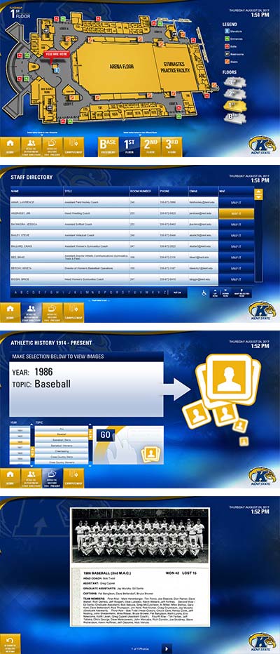
A great example is the interactive project Visix created for the MAC Center at Kent State University. After the start page, users are taken immediately to a wayfinding map of the entire center, including a You Are Here tag, every floor layout from the basement to the 3rd floor, and locations of entrances, exits, stairs, elevators and restrooms with an easy-reference legend.
All navigation through screens is handled by buttons placed at the bottom of the screen to meet ADA guidelines. And, of course, an often forgotten but important tool is the Home button that allows users to navigate back through pages to the original interface.
In addition to floor map choices, a campus map shows where on property the MAC center is, as well as other buildings, roads and common areas, and a scrollable campus directory. There’s also a QR tag to take the user directly to the KSU website. The Athletic Department Staff directory has a scrollable listing of current staff with names, departments, room numbers, and contact information. Each entry also has a Map It option, so users can immediately see where in the MAC Center the individual is located.
A very special part of the project is the Athletic History 1914 to Present option. This lets visitors search through photos of Kent State’s various athletics teams through the years. Categories include baseball and softball, basketball, cheerleading, cross country, field hockey, football, golf, gymnastics, ice hockey, soccer, swimming, tennis, track, volleyball, weightlifting and wrestling. In addition, there are categories for individual awards and facilities. Navigation couldn’t be easier – the user just taps on the topic and the year (if no year is selected, it defaults to all years in the archive) and then hits GO. Archival images are then displayed in an easy slideshow format.
There’s no better way to present such rich historical data on site, where visitors are already pumped up for a game. The audience chooses what interests them, and a couple of screen taps later, they have it right in front of them. This reinforces Kent State’s proud athletics tradition while giving the user ultimate freedom and fun.
This is a great example of maximizing screen real estate. Instead of spreading out information over multiple displays, providing deep navigation on a touchscreen kiosk lets you save money on hardware and provide a convenient one-stop shop for your audience.
Whether a campus, school, hospital, business or government office, you can use interactive kiosks to present wayfinding, directories, event schedules, donor info, halls of fame, timelines, videos, games and more. The possibilities are endless. All you need is a good design team to help make sure that your audience can get what they need quickly and intuitively.