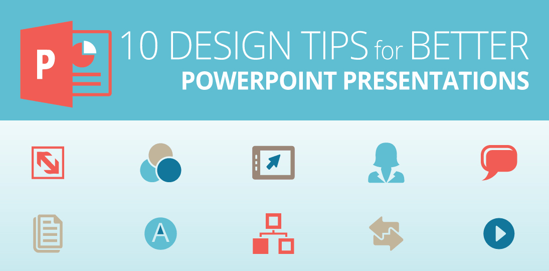
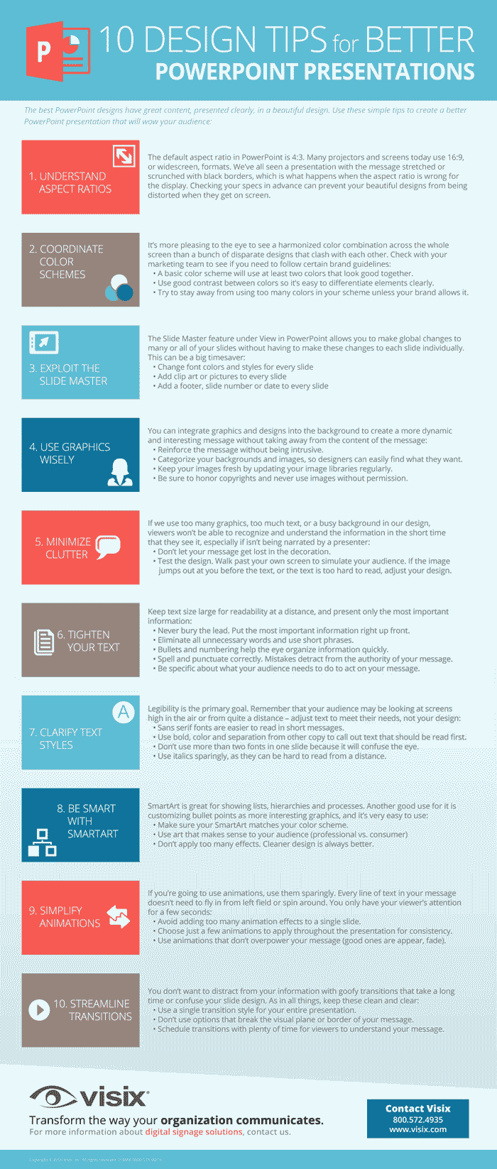
We’ve all seen bad PowerPoints, and we want to avoid creating any more of them. The best presentations have great content, presented clearly, in a beautiful design. In our infographic, we give you ten PowerPoint design tips that will help you on your way:
- Understand aspect ratios
- Coordinate color schemes
- Exploit the Slide Master
- Use graphics wisely
- Minimize clutter
- Tighten your text
- Clarify text styles
- Be smart with SmartArt
- Simplify animations
- Streamline transitions
In many cases, you can start with a PowerPoint template and tweak it to fit your own brand guidelines. This can save you a lot of time and headaches. If you want to start from scratch, be sure to create your own master slides so that changes and additions can be applied globally. It’s all about saving yourself time and producing the best presentation you can.
As in all communications, visual or otherwise, think about your audience and your goal. What do you want them to take away from the presentation? What’s the minimal amount of information you can put on a slide to convey your idea? (Nobody wants you to read bullets to them. Create takeaway docs separately from what you’ll show on screens.) Consider what size screens your presentation will be on, and if it will work across both large projections and desktop monitors.
Want to show your PowerPoints on digital signs? We can help. In the meantime, use these simple PowerPoint design tips to create better presentations that will wow your audience:
Want more advice on designing in PowerPoint for digital signage? Read our white paper here.