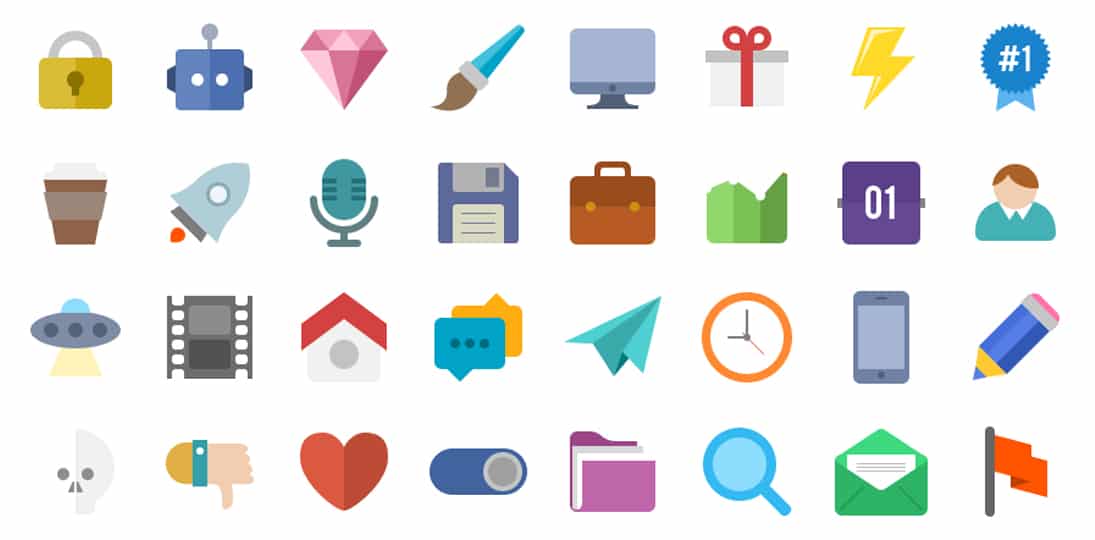
Sure, we all fell in love with that 3D look – textures, gradients, beveled, embossed, lots of drop shadows – but design, like fashion, technology and all other trends, moves forward. The latest trend is flat design.
This uses clean spacing, bright colors, crisp edges, and two-dimensional illustrations for simpler, cleaner elements that make shapes and information easier to read on a variety of screen sizes. If you look at your Windows start screen or your smartphone, most of the icons are using flat design.
This minimalist approach is great for digital signage content because it not only modernizes your designs, it makes icons and imagery easier to read on busy screens. Flat design also lends itself to icon systems, which are a great way to standardize content types for easy recognition by your audience.
Wayfinding maps and interactive content can especially benefit from flat design. Instead of buttons looking like pop-up bubbles and maps being cluttered with shading and shadows, a flat type of design presents a lot of information clearly and cleanly to help the user navigate faster.
Flat doesn’t have to be boring, either. The use of bright colors, good contrast and intuitive shapes grab attention and help guide the viewer’s eye.
As we always have to remind ourselves – form follows function. The goal is to communicate your message and lead your viewer to the information, button, map or other data you want them to see, interact with and use. The simpler and more striking the design elements, the easier that is to achieve.